In welding, strength is assumed until branding suggests otherwise.
Commercial buyers do not debate whether a contractor is capable. They make rapid judgments based on visual signals during shortlisting, bid reviews, and vendor comparisons.
A peer-reviewed empirical study published on ResearchGate shows that visual appearance has a direct and significant impact on perceived reliability and overall quality, with user experience reinforcing those perceptions early in the evaluation process.
That principle helps clarify why welding company logo ideas carry real weight in commercial positioning. When logos appear inconsistent or poorly structured, trust erodes before any qualifications are reviewed. When they appear deliberate and controlled, credibility forms faster.
As Ludwig Mies van der Rohe said,
“God is in the details.”
In industrial branding, those details influence confidence long before capability is assessed.
This article explains how welding contractors can use strategic logo design to support credibility, reduce buyer hesitation, and strengthen their position before a bid is ever reviewed.
Key Takeaways
- Welding logos are judged before skill is ever reviewed.
- Visual consistency signals professionalism and control.
- Logos must work on trucks, equipment, and documents.
- Simple and disciplined design reduces buyer hesitation.
- Strong branding supports approval, not persuasion.
The Strategic Difference Between Trade Logos and Industrial Logos
A trade business logo can help attract local and short-term work.
An industrial logo is built to support long-term contracts, repeat buyers, and large-scale partnerships.
The difference is not creativity but restraint, clarity, and execution under real operating conditions.
Industrial branding is evaluated by engineers, project managers, and procurement teams who prioritize legibility, standardization, and low perceived risk.
Fabrication branding must communicate control and technical confidence across proposals, equipment, documentation, and job sites.
Logos built around trends or decorative elements may look interesting in isolation, but they often lose authority in bid reviews and reproduce poorly on trucks, uniforms, and industrial materials.
In industrial markets, branding succeeds when it feels disciplined, systemized, and reliable rather than expressive.
What Makes Welding Company Logo Ideas Effective for Industrial Work?
Effective logo ideas for welding companies are built around discipline, not trends.
They are designed for industrial environments where logos are judged quickly on trucks, equipment, permits, safety documents, and bid headers. In these settings, buyers do not analyze design. They assess clarity, control, and reliability at a glance.
The most effective welding company logo ideas share a small set of non-negotiable attributes:
- Clear geometry that remains recognizable from a distance
- Strong contrast that holds up in outdoor and low-visibility conditions
- Simplified forms that avoid unnecessary detail
- Industrial symbolism that suggests precision and structure, not decoration
- Scalable logo design that works across every real-world application
Beyond appearance, an industrial logo must perform under real constraints. It must remain legible as a vinyl cut, stencil, engraving, or embroidery.
It must support one-color logo usability on metal surfaces and maintain high-contrast logo design visibility on trucks, helmets, and equipment. It must also remain readable at reduced sizes on permits, invoices, and compliance paperwork.
This is not branding theory but operational branding built for how welding contractors are evaluated in commercial and industrial environments.
Professional Welding Logo Ideas vs Generic Trade Logos
Many trade businesses rely on the same visual shortcuts. Flames, sparks, clip-art welders, and overloaded icons are reused across trucks, websites, and proposal headers.
The result is visual sameness, which makes contractors harder to recognize and easier to dismiss during vendor comparisons.
Professional welding logo ideas stand apart because they are designed for clarity and control, not decoration.
They reduce visual noise and prioritize function in industrial environments where logos are scanned quickly and remembered briefly.
They consistently emphasize:
- Industrial branding logic built for trucks, equipment, and documentation
- Clean typography that remains readable from a distance on job sites
- Iconography that suggests precision and structure rather than chaos
- Visual identity systems that scale consistently across every asset
Generic trade business logos try to look tough.
Professional logos look controlled, disciplined, and reliable.
That distinction matters in commercial environments where buyers associate control with lower risk and higher operational confidence.
What Role Does Typography Play in Welding Logos?
Typography often carries authority faster than symbols in welding contractor logo ideas, especially in environments where names are scanned before icons.
On truck doors, proposal headers, safety documentation, and jobsite signage, readable type is usually the first element buyers process.
Effective typography choices in welding logos follow a few clear rules:
- Avoid novelty fonts that reduce credibility
- Favor industrial sans-serif or slab-serif styles built for heavy-duty use
- Maintain stroke consistency so lettering survives vinyl cuts, embroidery, and stencils
- Remain legible from a distance in outdoor and low-visibility conditions
Strong typography reinforces more than aesthetics. It supports professional service logo expectations, improves brand recognition, and maintains visual consistency across every asset a contractor uses.
Poor typography looks improvised and temporary.
Disciplined typography looks established, controlled, and reliable.
That distinction matters when buyers are assessing risk before approving a contractor.
How Color Psychology Impacts Welding Brand Perception
Color psychology is not abstract in welding and fabrication environments.
Colors are evaluated on trucks in direct sunlight, on equipment covered in dust, and alongside safety signage where clarity matters more than style.
In industrial branding contexts, certain color associations are widely recognized:
- Black signals authority, stability, and seriousness
- Steel gray suggests technical precision, machinery, and reliability
- Red, when used sparingly, communicates warning, urgency, and strength
- Yellow, when used carefully, supports visibility and safety awareness
Color choices should respect safety-first environments and avoid competing with established safety signage. They must also support high-contrast logo design so marks remain visible in motion, at a distance, and in changing light conditions.
Overuse of gradients or decorative palettes weakens trust because these treatments reproduce poorly on metal surfaces, vinyl decals, embroidery, and stencil applications.
In welding branding, if a color system fails in one-color use or loses clarity in sunlight, it introduces doubt before a contractor is ever evaluated on skill.
Logo Elements That Help or Hurt Industrial Credibility
| Logo Element | Helps Industrial Trust | Hurts Industrial Trust |
| Typography | Bold, simple, legible | Decorative, thin fonts |
| Color Use | Limited, high contrast | Multiple gradients |
| Iconography | Abstract, geometric | Literal clip-art |
| Scalability | Clear at small sizes | Detail-heavy |
| Consistency | Uniform across assets | Multiple versions |
This table aligns with professional branding standards used across B2B and industrial sectors.
Welding Contractor Logo Ideas Built for Real-World Use
Welding contractor logo ideas must be tested beyond mockups.
Mockups hide the conditions logos actually face in industrial environments, where branding lives on metal, vinyl, fabric, and paperwork rather than screens.
Key real-world touchpoints include:
- Truck doors viewed in motion and direct sunlight
- Equipment decals exposed to dust, heat, and wear
- Safety helmets and uniforms requiring instant recognition
- Fabrication floor signage seen at a distance
- Proposal headers, COI packets, and vendor portal listings
Logos that fail in these environments become unreadable, inconsistent, or forgettable, which introduces doubt during evaluation and approval.
This is where one-color logo usability becomes non-negotiable. Industrial production methods such as vinyl cuts, stencils, embroidery, and engraving rarely allow perfect lighting or full-color printing.
If a logo cannot hold clarity and contrast under those constraints, it fails the environments that matter most.
A Common Commercial Welding Review Scenario
The Situation
A growing welding contractor begins pursuing long-term industrial maintenance contracts instead of relying on local, one-off jobs.
The company has experience, certifications, and a capable team.
On paper, nothing is missing.
Yet during procurement reviews, the business repeatedly stalls at the same stage.
Shortlisted.
Reviewed.
Passed over.
The Problem Identified During Review
When proposals and compliance documents are evaluated side by side, small issues surface:
- The logo appears inconsistent across proposals, invoices, and safety paperwork
- Typography looks thin and uneven in scanned bid documents
- One-color versions break down on truck photos and equipment images
- Overall presentation feels pieced together rather than systematized
No one flags these issues directly.
But hesitation builds.
In regulated environments, hesitation is enough to stop momentum.
The Strategic Branding Shift
Instead of making surface-level adjustments, the contractor invests in custom logo design services built specifically for industrial use.
The focus shifts to:
- A simplified logo system designed for clarity
- Typography that remains legible in documents, at a distance, and in motion
- One-color versions optimized for vinyl, print, and embroidery
- Clear usage rules across proposals, COI packets, and vendor portals
The objective is not visual flair.
It is consistency and ease of approval.
The Result in Subsequent Evaluations
In later procurement cycles, internal buyer behavior changes:
- Branding no longer triggers questions during review
- Documents feel organized and professional at first glance
- The contractor advances through shortlists without friction
- Discussions center on scope and scheduling, not presentation
The logo does not win the contract on its own. It removes a reason to hesitate.
| Why This Pattern Repeats in Industrial Work
This scenario plays out regularly in commercial welding:
That is how logos influences decisions without ever being discussed. |
Why Consistency Matters More Than Creativity
Creativity can attract attention, but consistency is what earns trust in welding and industrial work. Buyers encounter a contractor’s brand across trucks, uniforms, safety documentation, invoices, proposals, and jobsite signage.
When those touchpoints feel disconnected, the business appears disorganized before capability is ever considered.
Industrial buyers consistently associate visual consistency with:
- Process discipline and operational control
- Safety awareness in regulated environments
- Organizational maturity across teams and locations
A consistent visual identity reduces uncertainty during vendor evaluation. It strengthens brand recognition, reinforces contractor branding credibility, and lowers perceived risk when decisions are made quickly.
This is why welding business logo ideas must function as a system rather than a single graphic. A professional system includes a primary logo, a simplified one-color version, and clear rules for how the mark appears across every real-world application.
How Welding Logos Align With Safety and Compliance Signals
In regulated industrial environments, buyers often use visual cues to estimate how disciplined a contractor’s operations might be.
Clean and consistent branding is frequently interpreted as a signal of procedural control, even before safety records or certifications are reviewed.
A welding logo designed for safety-first environments can visually suggest:
- Attention to detail across documentation and site materials
- Respect for established standards in regulated settings
- Organizational maturity during the prequalification and approval stages
This perception does not prove compliance, but it can reduce hesitation during early evaluation. Logos appear on COI packets, W-9 forms, safety manuals, equipment markings, and site signage.
When branding looks orderly and consistent in those contexts, buyers are more likely to view the contractor as process-driven and worth a second look.
In commercial welding, perception often determines whether a contractor advances to deeper review.
How Welding Logos Support Commercial Shortlisting
In procurement-heavy environments, logos function as visual shortcuts.
Buyers often encounter contractors first inside bid packets, procurement portals, approved vendor lists, and proposal headers, where time is limited, and comparisons are fast.
In those moments, logos help buyers quickly assess:
- Who looks established and organized
- Who appears to be safety-conscious in regulated environments
- Who feels reliable enough to review further
These judgments are tied directly to first-impression trust, which determines whether a contractor receives a second look or is quietly filtered out.
Strategic branding does not replace capability, but it helps buyers reduce uncertainty during shortlisting and evaluation.
In welding and industrial services, that reduction in perceived risk is often what moves a contractor from “review later” to “consider now.”
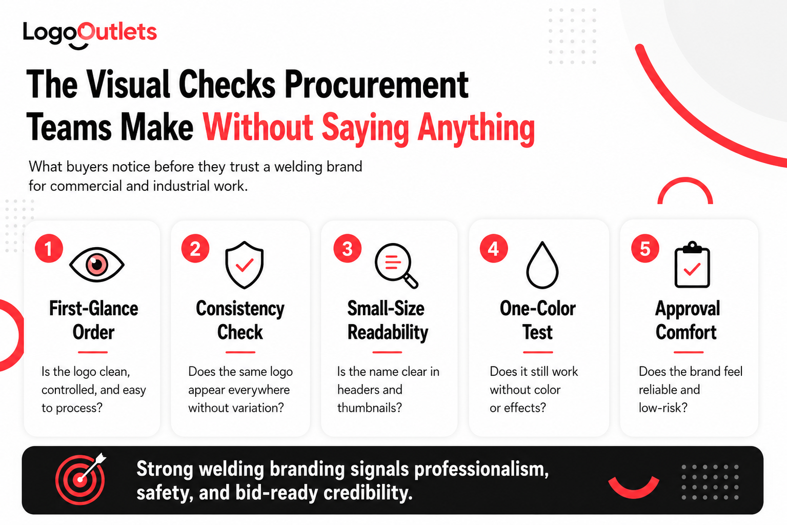
What Welding Company Logo Ideas Should Avoid
Certain design choices consistently weaken how welding contractors are perceived in commercial and industrial environments.
These failures rarely show up in mockups. They show up on truck doors, equipment decals, proposal headers, and vendor portals where logos are judged quickly and without context.
Welding company logo ideas should avoid the following pitfalls:
- Overly literal weld imagery, such as flames, sparks, or clip-art welders that look generic and blend into competitor listings
- Excessive detail that breaks down when logos are reduced, printed, embroidered, or cut in vinyl
- Trend-driven styles like ultra-thin lines, complex gradients, or decorative badges that date quickly and reproduce poorly
- Inconsistent logo versions that signal disorganization across trucks, documents, and job sites
- Thin or condensed typography that loses legibility in motion or at a distance
- Low-contrast color palettes that fail in one-color applications or outdoor visibility
These choices undermine contractor credibility because they suggest short-term thinking and a lack of systemization.
| Things to Consider:
In procurement-driven decisions, anything that looks improvised increases perceived risk and reduces the likelihood of shortlisting. |
Where Welding Company Logo Ideas Influence Final Buying Decisions
When buyers reach the final stages of evaluation, they are no longer comparing ideas. They are validating a choice already taking shape.
At this point, welding company logo ideas act as confirmation signals. They help buyers feel comfortable moving forward by reinforcing:
- Confidence in the contractor’s professionalism
- Reduced perceived risk during approval and onboarding
- Alignment with commercial and industrial expectations
This is the stage where logos appear on bid headers, prequalification documents, COI packets, and vendor portals. Small inconsistencies or weak visual signals introduce doubt. Clear, disciplined branding does the opposite.
Strong logos do not try to persuade but quietly support the decision already forming.
That reassurance is often what separates a contractor who gets approved from one who is quietly passed over.
Conclusion
Winning commercial and industrial welding work begins before a price is ever reviewed.
It begins when buyers form an opinion during shortlisting, proposal review, and approval.
The most effective welding company logo ideas are not artistic statements or creative experiments. They are business tools built for clarity, durability, and trust. When a logo aligns with industrial branding expectations and remains consistent across trucks, proposals, equipment, and documentation, it reduces hesitation during evaluation.
A professional logo will not replace skill.
It makes that skill easier to recognize, easier to trust, and easier to approve.
Before your next bid is reviewed, make sure your branding isn’t creating doubt. Logo Outlets designs logos that support approval, not hesitation. Reach us at info@logooutlets.com or 201-820-6598.
FAQs
How does Logo Outlets approach logo design for welding companies?
Logo Outlets takes an industrial-first approach, designing logos to function across trucks, equipment, documentation, and procurement materials. The focus is on clarity, consistency, and real-world performance, so branding supports credibility during commercial evaluation, not just visual appeal.
Why do welding contractors choose Logo Outlets for branding projects?
Welding contractors choose Logo Outlets for a process built around procurement realities. The work is structured to reduce uncertainty during bid reviews and vendor approvals, helping businesses present themselves as organized, reliable, and ready for regulated environments.
What defines professional welding logo ideas?
Professional welding logo ideas prioritize legibility, structure, and restraint. They rely on disciplined typography, strong contrast, and simplified forms that communicate reliability and control rather than decorative or trend-driven visuals.
What should contractors look for in welding company logo ideas for contractors?
Welding company logo ideas for contractors should be judged by how well they perform in real conditions. Strong logos remain clear on trucks, proposal headers, safety documents, and equipment markings, even in one-color or reduced-size use.
What do strong industrial welding logo examples have in common?
Effective industrial welding logo examples share consistent traits: high contrast, clean typography, and systemized usage across documents and assets. These logos are designed to repeat reliably in regulated environments without losing clarity or authority.
Why is welding logo design for trucks and equipment so important?
Welding logo design for trucks and equipment matters because these surfaces are often the first brand impression buyers see. Logos must stay readable in motion, under sunlight, and across vinyl, decals, and metal surfaces to maintain trust.
What does a custom welding company logo design involve?
Custom welding company logo design involves building a complete logo system rather than a single mark. This includes scalable typography, one-color versions, spacing rules, and file formats that work across print, vinyl, embroidery, and digital use.
How does professional logo design for welding contractors support business growth?
Professional logo design for welding contractors helps remove hesitation during procurement and approval. When branding looks controlled and consistent, reviewers focus on scope and capability instead of questioning organization or presentation.
What should businesses expect from branding services for welding companies?
Branding services for welding companies should extend beyond the logo itself. A complete service includes usage guidelines, application-ready assets, and visual consistency across proposals, compliance documents, vehicles, and job-site materials.