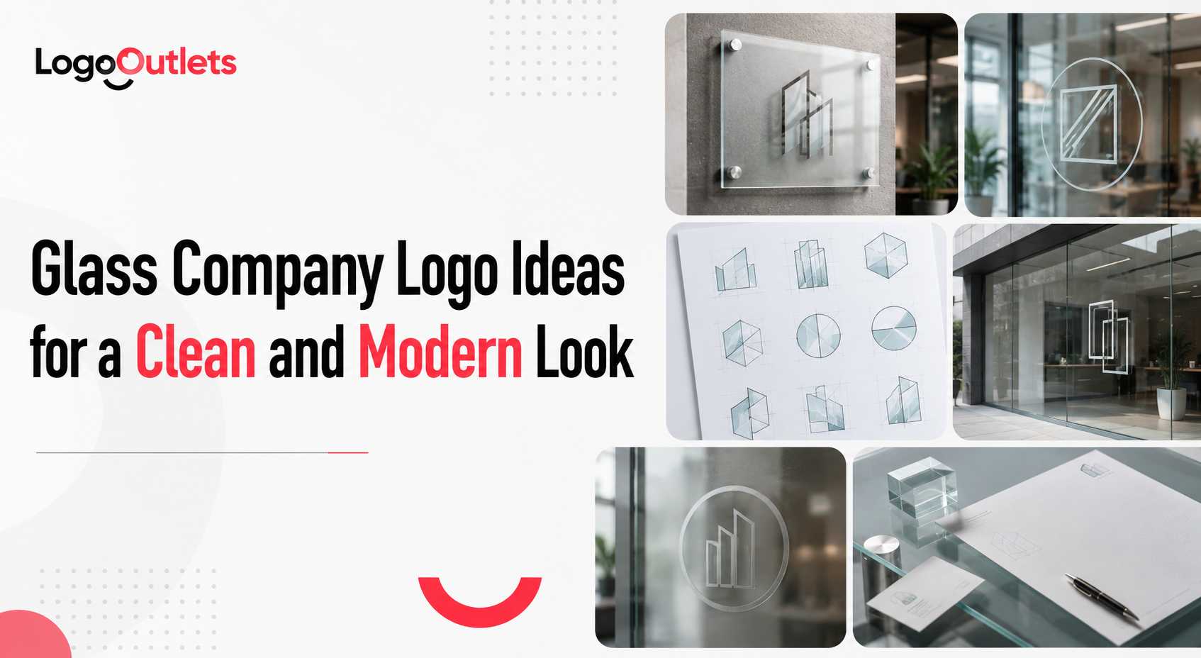
Most glass companies don’t lose business because of poor workmanship.
They lose it before a conversation even begins.
An outdated or generic logo signals sameness in an industry where precision and trust are expected by default.
That judgment happens instantly at a truck door glance, a storefront pass by, or a proposal header skim, often without context or explanation.
This is why glass company logo ideas matter far more than aesthetics. Research from McKinsey & Company’s Design Index shows that businesses with strong design capabilities consistently outperform their peers over time.
As Paul Rand put it,
“A logo doesn’t sell, it identifies.”
When that identity looks dated or indistinct, differentiation collapses before expertise is ever evaluated.
The sections ahead break down how clean, modern logo decisions rooted in clarity, restraint, and scalability shape trust, recognition, and long-term brand clarity for glass businesses.
Key Takeaways
- Glass logos are judged in seconds, often before any conversation or quote review.
- Clean, modern logo design signals trust, precision, and professionalism at a glance.
- Simplicity improves legibility across trucks, storefront glass, and proposals.
- Generic or outdated logos weaken differentiation in competitive glass markets.
- Strong logo systems support recognition and credibility as businesses scale.
Why Glass Company Logos Are Judged Faster Than Most Industries
Glass businesses operate in a high-trust and high-risk category.
Customers are not just buying a service.
They are placing confidence in safety, accuracy, and execution.
Glasswork is immediately associated with:
- Safety and breakage risk
- Measurement accuracy and installation tolerance
- Clean execution in visible spaces
- Structural reliability and code compliance
Those expectations transfer directly to branding.
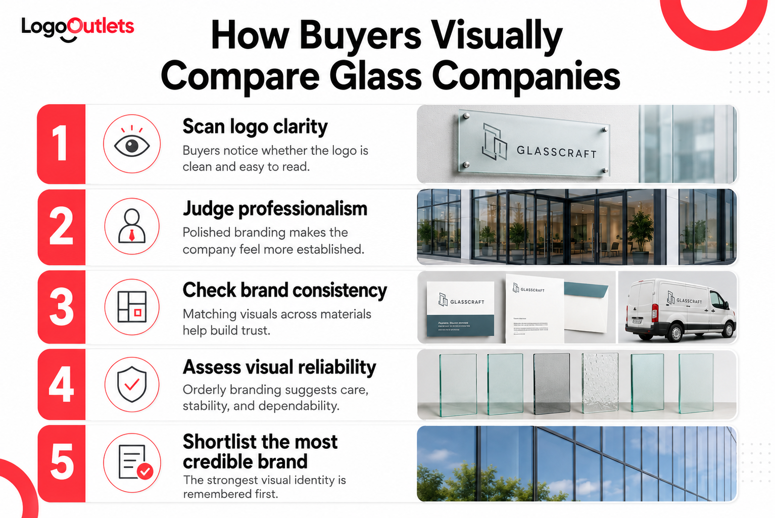
Before capabilities are evaluated, the brand is scanned.
In industries like glass, branding is rarely read but glanced at.
That is why a professional glass company logo functions as a credibility shortcut. It signals order, competence, and reliability at a glance. When the logo looks generic or outdated, it introduces friction into the decision process and forces customers to rely on price or proximity instead of confidence.
This is not about design taste but how trust is formed when there is no room for error.
What Makes Glass Company Logo Ideas Look Clean and Modern
Clean does not mean basic.
Modern does not mean trendy.
Strong glass logo design ideas are built on restraint, not decoration. In the glass industry, clarity matters because the work itself is precise, visible, and unforgiving. Branding that feels cluttered or overworked immediately conflicts with that expectation.
Clean and modern glass logos consistently share a few defining traits:
- Clear typography with balanced spacing that stays legible on trucks, storefront glass, and documents
- Limited color palettes chosen for contrast and visibility, not visual flair
- Symbols that reference structure, alignment, or panel geometry rather than literal glass icons
- Layouts designed to remain readable at small sizes and in single-color applications
This is why modern glass logo design prioritizes simplicity and structure. Visual restraint supports recognition, scalability, and professional perception without competing with the work itself.
Who Needs Clean Glass Business Logo Ideas the Most
Clean branding matters most in glass businesses where decisions are made quickly, and trust is evaluated before any conversation takes place. These are environments where branding is scanned, not studied.
The segments that benefit the most from clarity-first identity systems include:
- Commercial glazing firms bidding on corporate and institutional contracts, where visual professionalism influences shortlisting before proposals are
- Residential glass installers competing on trust, safety, and reliability rather than price alone
- Manufacturers selling to architects and developers, where brand perception affects specification decisions and long-term partnerships
- Multi-location glass service providers that need brand consistency across vehicles, job sites, uniforms, and documentation
For these businesses, glass business logo ideas must support scale, recognition, and repeatability across every touchpoint. A logo that only looks good on a website is not enough when credibility has to travel with the brand.
Types of Logo Ideas for Glass Companies That Actually Work
Not every logo style works in the glass industry.
The most effective systems are the ones that survive real-world use, fast judgment, and long buying cycles.
Below are the logo approaches that consistently perform well for glass companies, for clear and different reasons.
1. Typography-Forward Logos
Typography-led logos are widely used in trade service branding because they communicate professionalism instantly and hold up under real-world conditions.
They are especially effective for:
- Commercial glass branding tied to corporate bids and facility contracts
- B2B manufacturers selling through procurement or specification channels
- Glass companies operating vehicle fleets where logos are seen briefly and at a distance
A typography-first system strengthens:
- Brand recognition through repeatable letterforms
- Legibility during quick scans on trucks, job sites, and signage
- Consistency across proposals, invoices, uniforms, and digital listings
This makes typography-driven marks a reliable foundation for a window and glass company logo where clarity matters more than decoration.
2. Minimal Symbol + Wordmark Systems
Minimal symbols paired with structured wordmarks perform better than complex illustrations because they balance recognition with flexibility.
Effective symbols often reference:
- Panel alignment and edge geometry
- Framing and structural boundaries
- Linear forms that suggest precision and measurement
This approach works particularly well when logos must adapt across:
- Trucks and trailers
- Safety gear and hard hats
- Storefront glass, decals, and etched applications
For growing businesses, this structure supports scalable logo design without relying on literal or overused glass imagery. It is a common foundation for logo ideas for glass companies preparing for expansion, additional locations, or increased brand exposure.
3. Industry-Neutral Professional Logos
Some of the strongest professional logo systems do not rely on obvious or literal glass symbolism.
Instead, they communicate:
- Stability through restrained typography
- Organization through structured layouts
- Operational maturity through visual discipline
This approach is particularly effective in commercial glass branding, where decision-makers such as architects, developers, and facility managers prioritize reliability, documentation, and long-term partnerships over decorative visuals.
By avoiding obvious industry cues, these logos position the business as established, dependable, and specification-ready.
The Role of Color Psychology in Glass Company Branding
Color decisions in glass branding are functional, not personal.
They influence trust and professionalism before services, pricing, or capability are ever evaluated.
In glass company branding, color must perform under real-world conditions. Logos appear on transparent surfaces, reflective glass, vinyl decals, uniforms, invoices, and vehicles. If a color choice fails in high contrast or one-color applications, it fails in practice.
The most reliable functional color lanes in glass branding include:
- Blue is commonly associated with trust and reliability, and is highly legible across vehicles, signage, and digital listings
- Gray is used to signal precision, structure, and technical competence without visual distraction
- White is applied primarily as negative space or contrast to reinforce cleanliness and clarity, rather than as a standalone ink
When applied with restraint, color psychology supports business credibility quietly and consistently.
| Branding Principle:
The goal is not to decorate the brand, but to ensure recognition, legibility, and confidence wherever the logo appears. |
Typography Choices That Support Brand Consistency
Typography is not a design detail but the structural backbone of a brand’s visual system.
In glass businesses, typography must perform under real-world conditions. Logos appear on reflective surfaces, vinyl-cut decals, etched glass, uniforms, invoices, and small-format signage.
If the typeface breaks down at a distance or in one-color use, brand consistency collapses quickly.
Strong glass brands typically rely on typography that prioritizes clarity and control:
- Sans-serif fonts with even stroke weight to maintain legibility on vehicles, storefront glass, and safety materials
- Carefully managed letter spacing to prevent distortion or visual noise at small sizes
- Limited font families to ensure consistency across proposals, digital listings, and printed assets
Typography decisions directly shape how reliably a brand is recognized across every touchpoint. When type is inconsistent or overly stylized, professionalism erodes and trust weakens before services are even considered.
Comparison of Logo Approaches for Glass Companies
| Logo Approach | Best For | Strength |
| Typography-Only | Commercial glass firms | Maximum legibility |
| Minimal Symbol + Text | Residential & service brands | Balanced recognition |
| Abstract Geometry | Manufacturers | Scalable identity |
| Badge-Style Logos | Legacy brands | Traditional appeal |
This table reflects patterns observed across trade service branding projects documented by design organizations such as AIGA.
A Realistic Scenario Glass Businesses Run Into All the Time
Scenario
Consider a regional glass service provider handling both residential installs and light commercial work. The company has been operating for years, with steady referrals and solid workmanship. Growth slows not because of demand, but because new leads increasingly compare multiple vendors before calling.
The Problem
On paper, nothing is wrong.
In practice, the brand sends mixed signals.
- The logo looks dated compared to newer competitors
- Typography varies between trucks, proposals, and invoices
- Colors lose contrast on vehicle decals and storefront glass
- At small sizes, the company name becomes hard to read
During quick comparisons, the brand blends in instead of standing out.
The Approach
Instead of changing services or pricing, the business focuses on visual clarity and consistency. After evaluating its brand touchpoints, the company decides to work with professional custom logo design services to address the problem systematically rather than patching visuals piece by piece.
The branding update centers on:
- A typography-forward logo for instant name recognition
- A limited, high-contrast color palette that works on glass and vinyl
- A simplified layout system that stays consistent across all materials
No trends are followed, and no decorative elements are added.
The goal is not to look “creative,” but to look reliable at a glance.
The Outcome
After the update, the brand performs differently in real-world moments:
- Trucks are easier to identify from a distance
- Proposal headers feel more professional and organized
- Online listings look clearer when viewed quickly
- Visual consistency improves across every touchpoint
The work didn’t change, but perception did.
In industries like glass, that shift alone is often enough to remove hesitation and support early-stage trust before any conversation takes place.
How Contractor Logo Design Differs in the Glass Industry
Contractor logo design in the glass industry is shaped by real-world conditions, not creative preference. Logos are rarely viewed in ideal environments. They are seen quickly, often at a distance, and usually on challenging surfaces.
In day-to-day use, glass contractor logos must perform under conditions such as:
- Dirt, dust, and job-site wear
- Glare from glass, chrome, and reflective vehicle surfaces
- Long viewing distances on trucks and site signage
- Low-light situations during early or late service calls
Glass adds constraint. Logos frequently appear on transparent or semi-transparent surfaces, vinyl decals, etched panels, and one-color applications. Fine details and thin lines disappear fast.
This is why minimalist logo design consistently outperforms complex visuals in glass services. Simpler marks maintain contrast, hold legibility, and reproduce reliably across trucks, safety gear, storefront glass, and printed materials.
In contractor logo design, clarity is not a style choice but a functional requirement.
Why Brand Recognition Depends on Simplicity
Brand recognition is not built through novelty but through repetition and clarity.
In the glass industry, logos are rarely studied. They are noticed briefly on trucks, storefront glass, invoices, and online listings.
In those moments, complex visuals do not create memorability but friction.
Simple logos perform better because they survive repetition across real-world use:
- They are easier to recognize during quick visual scans
- They reproduce consistently on vinyl, etched glass, and print
- They remain legible at small sizes and from a distance
When a logo is easy to recognize and easy to apply everywhere, it becomes familiar.
| Familiarity builds confidence, and confidence builds trust. |
In practical terms, simplicity is not a creative preference. It is the mechanism that allows a glass brand to be remembered, recognized, and taken seriously before any conversation takes place.
The Connection Between Logo Design and Business Credibility
A logo does not sell glass services directly, but removes doubt at the moment trust is first evaluated.
In the glass industry, credibility is tested before a conversation begins. It happens during quick comparisons, at a truck-door glance, on a proposal header, or in a search result list.
In those moments, the logo acts as a signal of legitimacy and professionalism.
Strong logo design supports credibility by:
- Establishing trust quickly during first impressions
- Clarifying positioning when multiple providers appear similar
- Reducing hesitation during early sales conversations
This is why professional logo design for glass companies is an operational investment, not a cosmetic one. A clear, consistent logo system supports credibility across vehicles, signage, documents, and digital platforms long before services are explained or pricing is discussed.
When Custom Glass Logo Design Becomes Necessary
Template logos work only until a glass business becomes more complex. As services expand and visibility increases, templated designs begin to break down across real-world use.
In the glass industry, templates fail because they are not built to scale across fleets, signage, proposals, and multiple service offerings. What looks acceptable on a website often falls apart on trucks, storefront glass, and printed documents.
Clear indicators that a custom glass logo design is needed include:
- Multiple service lines, such as repair, installation, commercial glazing, or fabrication
- Entry into commercial contracts where credibility affects shortlisting
- Franchise or multi-location growth that requires strict visual consistency
- Inconsistent branding across vehicles, uniforms, invoices, and digital platforms
At this stage, glass company logo design services shift from a visual upgrade to a growth-support system. A custom logo is no longer about looking different. It is about maintaining clarity, recognition, and trust as the business scales.
Why Branding for Glass Companies Must Scale
Branding is not static in the glass industry.
It is exposed to constant expansion, duplication, and real-world stress.
As a glass business grows, its brand is repeated across more surfaces, locations, and formats. If the identity system is not designed to scale, inconsistency appears fast, and credibility erodes just as quickly.
Effective branding for glass companies must hold together across:
- Additional vehicles added to the fleet
- New locations with storefront glass, signage, and decals
- Digital platforms where quick comparisons are made
- Sales materials such as proposals, invoices, and bid documents
When branding scales cleanly, recognition stays intact. When it does not, the brand becomes fragmented and confusing.
Scalability protects long-term brand equity by ensuring the business looks like the same company everywhere it shows up.
In trade services like glass, consistency is not a polished detail. It is what allows trust, recall, and professionalism to survive growth.
What to Avoid in Glass Company Logo Ideas
Certain logo choices consistently undermine credibility in the glass industry, not because they are unattractive, but because they fail under real-world use and fast judgment.
Glass company logos should avoid reliance on:
- Cliché industry symbols, such as glass shards or generic window icons, signal templated branding and make the business blend in rather than stand out
- Clipart-style graphics that lack structure and fail to reproduce cleanly across vehicles, signage, and digital platforms
- Excessive gradients or effects that break down in vinyl decals, embroidery, one-color printing, and etched glass applications
- Decorative or novelty fonts, including script and overly stylized typefaces, which reduce legibility and weaken professional perception
- Overly detailed marks with thin lines or small elements that disappear at a distance or on reflective surfaces
These choices do more than affect appearance. They weaken trade service branding by reducing clarity, consistency, and trust during quick visual comparisons.
In industries like glass, where logos are scanned rather than studied, complexity becomes a liability.
Final Thoughts
Strong glass company logo ideas are not artistic experiments.
They are clarity systems designed to perform under real-world conditions.
The most effective logos consistently:
- Establish trust quickly during first impressions
- Hold up across trucks, storefront glass, proposals, and uniforms
- Maintain recognition through repetition, not novelty
A clean and modern logo does not rely on trends to stay relevant. It reinforces reliability through simplicity, structure, and consistency.
For glass service providers and manufacturers, branding is no longer a nice-to-have or a surface-level decision. It is a foundational asset that supports credibility, recognition, and growth long before any conversation takes place.
If there’s uncertainty about how a current logo performs outside a website or mockup, a real-world evaluation is often the smartest next step. Logo Outlets helps glass businesses assess clarity, scalability, and credibility before branding becomes a bottleneck.
Reach out at info@logooutlets.com or call 201-820-6598 to start the conversation.
FAQs
- How does Logo Outlets approach logo design for glass businesses?
Logo Outlets approaches logo design with a real-world lens. Every logo is built to remain clear, legible, and consistent across trucks, storefront glass, proposals, and digital platforms, not just mockups or websites.
- Does Logo Outlets provide branding support beyond the logo?
Yes. Beyond logo creation, Logo Outlets supports glass businesses with structured brand systems, including typography standards, color usage rules, and consistency guidelines to help brands scale without fragmentation.
- What is a custom glass logo design, and when is it necessary?
Custom glass logo design becomes necessary when template logos can no longer support growth. This typically happens when a business adds service lines, enters commercial contracts, expands locations, or struggles with inconsistent branding across assets.
- What should glass company logo design services include?
Glass company logo design services should address more than appearance. They must account for distance legibility, one-color reproduction, contrast on glass and vinyl, and consistency across physical and digital touchpoints.
- What makes a professional logo design for glass companies?
Professional logo design for glass companies prioritizes clarity and structure. Clean typography, restrained color palettes, and simple layouts help signal reliability and competence during fast visual evaluations.
- How does branding for glass companies support long-term growth?
Branding for glass companies supports growth by maintaining recognition and trust as the business expands into new vehicles, locations, services, and platforms. Scalable branding prevents confusion and protects credibility over time.
- What are the best glass company logo ideas based on real-world use?
The best glass company logo ideas are simple and repeatable. Typography-driven marks or minimal structural symbols hold up better on trucks, storefront glass, uniforms, and proposals than complex or decorative designs.
- Where can businesses find useful examples of glass company logos?
Examples of glass company logos are most useful when observed in real-world contexts such as vehicle fleets, storefront signage, trade publications, and professional design portfolios. The strongest examples emphasize clarity, repetition, and consistency rather than literal glass imagery.