Event planners often lose clients before a conversation ever begins.
No rejected proposal. No pricing objection. Just silence.
That silence leads many planners to ask the wrong question:
“How do we get more clients?”
The more revealing question is this:
“Why don’t prospects feel confident choosing us immediately?”
In most cases, the answer is visible long before an inquiry form is opened. Branding, more specifically the logo, plays that role.
That is why event company logo ideas are not a creative exercise. They are a business decision that shapes trust in seconds.
In service-based industries like event planning, results cannot be previewed. Clients rely on visual signals to judge credibility.
Research cited in a Touro Law Review publication, referencing findings from the University of Loyola Maryland, indicates that color can increase brand recognition by up to 80%.
When a logo feels generic or unclear, prospects hesitate.
And hesitation quietly costs business.
As brand strategist Marty Neumeier put it:
“Your brand is not what you say it is. It’s what they say it is.”
This guide breaks down event company logo ideas designed to shape that perception early, before prospects scroll past or choose someone else.
Key Takeaways
- Event company logos influence trust and perception before any conversation begins.
- Strong logo strategy matters more than visual trends or decoration.
- The right logo attracts better-fit clients and filters out misaligned inquiries.
- Clarity, consistency, and scalability are non-negotiable in event branding.
- Effective event company logo ideas are business decisions, not design exercises.
Why Event Company Logos Matter More Than Most Owners Realize
Event businesses sell experience before delivery.
There is no trial run.
No product demo.
Clients must decide whether to trust a company without seeing the outcome.
That reality gives the logo disproportionate influence in event business branding. It is often the first signal prospects encounter on a website header, social profile, proposal, or vendor deck.
Before credentials are read or conversations begin, the logo sets expectations about professionalism, organization, and credibility.
A strong logo functions as:
- A shortcut to brand trust
- A visual signal that the business is established and reliable
- A positioning filter that typically attracts quality-driven clients while discouraging purely price-based inquiries
In industries where outcomes are intangible until after purchase, visual consistency becomes the proxy for reliability.
In event branding, that consistency starts with the logo and carries through every touchpoint.
When a logo feels clear, intentional, and aligned with the service being offered, it reduces friction in the decision-making process.
When it feels generic or inconsistent, it introduces hesitation. And in a crowded market, hesitation is often enough for a prospect to keep scrolling.
What Makes an Event Company Logo Actually Attract Clients?
Before exploring styles, clarity matters more than creativity.
Effective event company logo ideas are not defined by how attractive they look, but by how clearly they communicate value, credibility, and relevance within seconds.
The logos that consistently attract clients share these characteristics:
- Clear industry and audience relevance: The logo immediately signals that the business operates in the event space and understands its market, whether corporate, luxury, or experiential.
- Strong first impression branding: It creates confidence at first glance on a website header, social profile, proposal cover, or vendor deck.
- Visual distinction from competitors: It avoids generic icons, overused symbols, and templated layouts, making the brand recognizable rather than forgettable.
- Logo scalability across digital and print: The mark remains legible and recognizable at small sizes, works in monochrome, and holds up across websites, social media, invoices, signage, and print materials.
- Alignment with target audience expectations: The design matches the level of professionalism, pricing, and experience the business intends to sell, preventing a mismatch between perception and reality.
A logo that looks impressive but fails to communicate these signals does not just underperform aesthetically. It reduces trust, increases hesitation, and weakens conversion at the earliest stage of the buying decision.
1. Minimalist Event Logos That Signal Professional Confidence
Minimalism is most effective when an event business needs to project control, credibility, and professionalism rather than spectacle.
Minimalist event logos strip away visual noise and rely on disciplined typography, balanced spacing, and intentional restraint.
The goal is not to look simple, but to look organized and dependable at first glance.
This style is especially effective when a business wants to appear:
- Structured and reliable: Clean layouts and predictable visual systems signal operational competence.
- Credible at an executive level: Minimal design is commonly associated with corporate environments where clarity and risk reduction matter.
- Premium without visual excess: Restrained color palettes, strong typography, and generous spacing communicate value without appearing decorative.
Why this approach works
- Simpler logos improve recall: Fewer elements make the mark easier to recognize and remember, especially after brief exposure.
- They perform better in cross-platform logo design: Minimalist marks remain legible on website headers, social media avatars, proposal covers, invoices, and event signage.
- They age more slowly than trend-driven visuals: This protects brand consistency over time and reduces the need for frequent redesigns that dilute recognition.
Because corporate buyers often associate clean branding with low operational risk, this approach is widely used in professional event company logo ideas targeting corporate events, conferences, and B2B clients.
2. Luxury Event Logos Designed for High-End Experiences
Luxury branding is defined by control, not decoration.
In event branding, high-end positioning depends on restraint. Luxury event logos remove visual noise and focus on disciplined typography, intentional spacing, and limited color use to signal credibility and confidence.
This approach consistently relies on three execution principles:
- Sophisticated typography: Well-proportioned typefaces communicate professionalism and pricing confidence without ornamentation.
- Balanced spacing and layout: Clear structure and white space reduce visual friction and improve perceived quality.
- Controlled color psychology: Restrained palettes prevent distraction and support a composed, premium impression.
Event planners working in weddings, galas, and private experiences benefit most from this approach because affluent clients evaluate brands through perceived risk. Understated visuals reduce uncertainty. Overdesigned logos introduce doubt.
Luxury logos are built for real-world use, not trend cycles. They must remain clear and credible across invitations, proposal covers, monograms, signage, and social avatars. Design choices that hold up in these environments signal operational maturity and attention to detail.
For that reason, this direction is consistently used in event planning company logo ideas targeting high-end markets, where trust, discretion, and perceived value outweigh novelty.
3. Modern Event Logos That Appeal to Contemporary Brands
Modern branding prioritizes clarity, adaptability, and digital performance.
Modern event logos are built around clean geometry, structured layouts, and limited color systems designed to work across screens first, print second.
The goal is not decoration, but fast recognition and operational credibility.
This style works best for:
- Brand activations: Where logos must remain clear across social posts, landing pages, and sponsor materials.
- Product launches: Where modern visuals signal innovation, momentum, and relevance.
- Tech and startup-focused events: Where audiences expect contemporary design systems and digital-first branding.
Modern logos support these environments because they scale cleanly across platforms. They remain recognizable at small sizes, perform well in one color, and maintain clarity on websites, mobile screens, presentation decks, and social avatars.
For event companies and agencies, this direction offers a practical balance. It communicates modern operations and relevance without alienating corporate buyers or introducing visual risk.
That is why it remains a reliable option for creative event company logo ideas that still need to convert commercially.
4. Corporate Event Logos Built for Enterprise Trust
Corporate branding prioritizes predictability, clarity, and risk reduction over creative expression.
Corporate event logos are designed to signal operational maturity and reliability at first glance. They rely on structured composition, disciplined typography, and conservative color use to project stability rather than personality.
This approach typically includes:
- Strong, legible typography: Typefaces with clear hierarchy that remain readable across conference materials, email headers, and proposals.
- Grid-based, predictable layouts: Structured composition that communicates order, control, and consistency
- Conservative color psychology: Neutral and high-contrast palettes that support clarity, accessibility, and professional credibility.
For event firms managing conferences or enterprise-level contracts, these cues matter because corporate buyers evaluate vendors through perceived risk. Branding that feels familiar, orderly, and consistent signals compliance, dependability, and low operational uncertainty.
Corporate logos must perform in real-world enterprise environments such as sponsor decks, event signage, lanyards, agendas, digital portals, and internal presentations.
Designs that prioritize clarity over novelty hold up in these contexts and support long-term brand positioning.
For that reason, this style is widely used by event companies serving enterprise clients, where trust, predictability, and professionalism outweigh visual experimentation.
5. Symbol-Based Logos That Tell a Clear Story
Symbols only work when they are intentional, distinctive, and easy to interpret at a glance.
In event branding, symbols act as visual shorthand.
When designed correctly, they communicate what the business stands for without explanation.
When designed poorly, they become decorative noise that confuses rather than clarifies.
Effective symbol-based event logos are built around clear ideas such as:
- Connection: Forms that suggest interaction or convergence, often used for networking events and conferences.
- Celebration: Abstract energy or motion cues appropriate for weddings, social events, and experiential brands.
- Precision: Clean, controlled shapes that signal structure and reliability for corporate and enterprise events.
- Experience flow: Directional or continuous forms that imply movement, progression, or journey, common in large-scale productions and activations.
To work commercially, symbols must meet strict execution standards. They should remain recognizable at small sizes, work in a single color, and rely on a simple silhouette. Overly detailed icons, gradients, or stock imagery weaken recognition and quickly feel generic.
Symbol-based logos are especially effective when their meaning is reinforced consistently across touchpoints such as websites, proposals, social profiles, and presentation materials.
When the symbol’s message is repeated through language and visuals, it strengthens the event’s brand identity and becomes a recognizable brand asset rather than just a decorative mark.
6. Typography-Driven Logos for Event Planners Who Want Authority
Typography-driven logos remove icons entirely and place the brand name at the center of the identity.
This approach works when the name itself needs to carry authority, recognition, and credibility. Instead of relying on symbols, the logo builds trust through letterform quality, spacing, and hierarchy.
This direction is most effective when:
- The company name is distinctive: A strong name becomes the brand asset, not an icon that competes for attention.
- Brand consistency is critical: A typographic mark remains consistent across websites, proposals, invoices, signage, and social profiles without reinterpretation.
- Long-term flexibility is required: Well-designed typography scales into wordmarks, monograms, social avatars, watermarks, and headers without losing clarity.
Typography plays a central role in logo design because buyers subconsciously associate clean, well-spaced letterforms with professionalism, stability, and pricing confidence.
Poor typography does the opposite.
Thin strokes, trendy fonts, or weak kerning instantly undermine authority.
Typography-driven logos perform especially well in logo ideas for event planners operating in brand-sensitive markets, where clients compare companies visually before evaluating portfolios or proposals.
When the type feels confident and disciplined, the business appears established before a single conversation begins.
7. Color Psychology-Based Logos That Influence Emotion
Color decisions are never neutral in branding.
They act as instant signals that shape expectation before a word is read.
In event branding, color functions as a shortcut for category fit, pricing perception, and trust.
When used intentionally, it helps prospects quickly understand what type of experience a brand represents.
Common color associations in event contexts include:
- Blue: Often associated with reliability and structure, making it effective for corporate conferences and enterprise events.
- Black: Commonly linked to sophistication and authority, frequently used in luxury, private, and invitation-only experiences.
- White: Suggests clarity and control, often chosen by modern production teams and minimalist event brands.
- Gold: Used sparingly to signal exclusivity and premium positioning, typically as an accent rather than a primary color.
In industries where services cannot be previewed, recognition reduces uncertainty and supports faster decision-making.
When applied with discipline, color psychology strengthens consistency across websites, social media, proposals, signage, and marketing materials.
This consistency improves recall and lowers perceived risk, turning color into a practical conversion lever in event management logo ideas, not a decorative choice.
8. Modular Logo Systems for Multi-Service Event Companies
Many event companies do not offer a single service.
They handle planning, design, and production under one brand.
A single static logo struggles in this environment because it cannot adapt to different services, audiences, or touchpoints without losing clarity. That is where modular logo systems become essential.
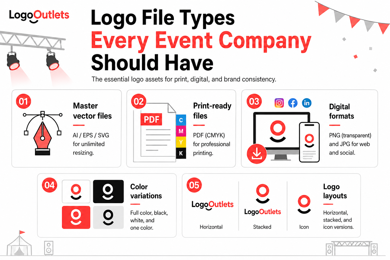
A modular logo system is built around a primary mark supported by controlled variations. These variations may include horizontal and stacked versions, service-specific lockups, or simplified marks for digital use, all governed by the same visual rules.
This approach supports:
- Logo scalability: The brand expands across new services or offerings without requiring redesigns or visual resets.
- Cross-platform logo design: The system performs consistently across websites, social profiles, proposals, signage, merchandise, and sponsor materials.
- Clear brand architecture: Each service is identifiable while remaining visually connected to the parent brand.
For multi-service firms, this structure allows growth without fragmentation. Instead of creating separate identities for each offering, the brand scales through a unified system that remains recognizable and controlled.
When executed correctly, modular systems are a foundational element of professional event business branding, enabling companies to expand their service lines while maintaining trust, consistency, and long-term recognition.
9. Industry-Specific Logos That Instantly Communicate Focus
Generalist logos dilute positioning and slow down decision-making.
In event branding, prospects want immediate clarity. An industry-specific logo helps them understand who the company serves and what type of events it specializes in before they read a single line of copy.
When done correctly, industry-specific visuals communicate:
- Audience focus: Whether the brand is built for corporate conferences, luxury weddings, nightlife events, or brand activations.
- Service expectations: Precision and structure for enterprise events, elegance for private experiences, or energy for experiential campaigns.
This clarity reduces perceived risk and shortens the path to action. Prospects are more likely to submit an inquiry, book a call, or open a proposal when the branding immediately signals relevance.
The key is suggestion, not literal symbolism. Strong industry-specific logos rely on tone, structure, and visual cues rather than obvious icons like balloons, confetti, or champagne glasses. Literal symbols feel generic and undermine professionalism, especially in competitive markets.
For event companies operating in crowded cities or niche segments, this approach strengthens visual identity for event companies by making the brand recognizable, credible, and purpose-built instead of interchangeable.
10. Timeless Logos Designed to Outlast Trends
Design trends change fast.
Brand recognition should not.
In event branding, a logo must remain clear and credible over years of use, not just during a single design cycle.
Timeless logos prioritize structure and clarity over fashionable effects, allowing brands to stay consistent as services expand, markets shift, and visibility increases.
This approach is built on three core principles:
- Balanced proportions: Logos follow clear geometric structure and visual hierarchy, ensuring stability and recognizability across all formats.
- Neutral & legible typography: Typefaces avoid trendy styling and excessive personality, remaining readable and professional at all sizes.
- Simple & disciplined composition: Fewer elements and a clear silhouette make the logo easy to recognize and less likely to look outdated over time.
Timeless logos protect brand equity by maintaining recognition and trust as a business grows.
They reduce visual churn, eliminate the need for frequent redesigns, and support long-term consistency in referral-driven industries like event planning.
A practical test of timelessness is performance. The logo should work in one color, remain clear at small sizes, and hold up across websites, proposals, signage, social profiles, and printed materials.
Trend-heavy elements such as ultra-thin strokes, decorative fonts, or gimmicky icons rarely pass these tests.
For event companies focused on stability, credibility, and sustained growth, timeless logo design is not a preference. It is a requirement for long-term brand positioning.
Comparison of Logo Styles and Business Goals
| Logo Style | Best For | Business Impact |
| Minimalist | Corporate & B2B events | Trust and clarity |
| Luxury | Weddings & private events | Premium pricing |
| Modern | Brand activations | Relevance |
| Corporate | Enterprise clients | Authority |
| Modular | Multi-service firms | Scalability |
Real-World Scenarios: How Logo Strategy Impacts Event Brands
Real-World Scenario 1: Corporate Event Agency Repositioning
A mid-sized event agency specializing in conferences and internal corporate events began struggling to gain traction with enterprise prospects despite a strong execution record. The challenge was not capability. It was perception.
The existing logo relied on decorative elements, inconsistent typography, and visual styling that did not align with corporate evaluation standards. For buyers scanning vendors, this created uncertainty during the early review stages.
After moving to a typography-driven, structured logo system, the brand began presenting itself more clearly in corporate contexts:
- The logo aligned visually with procurement and enterprise expectations
- Early conversations focused more on capability than credibility
- Initial impressions created less hesitation during vendor evaluation
The services remained the same.
The brand simply became easier to trust at first glance.
Real-World Scenario 2: Luxury Event Planner Repositioning for Premium Clients
A wedding and private-event planner wanted to attract higher-budget clients but consistently received price-driven inquiries. The branding felt energetic and expressive, but not restrained enough for a premium audience.
By adopting a luxury-focused logo approach built on controlled typography, spacing, and muted palettes, the planner repositioned the brand visually without changing offerings.
This type of shift typically helps:
- Increase perceived value before the first call
- Discourage misaligned, low-budget inquiries
- Support premium referral behavior within affluent circles
In this scenario, the logo functioned as a positioning filter rather than a decorative asset.
Real-World Scenario 3: Multi-Service Event Company Scaling Without Confusion
An event production company expanded from logistics into creative direction and design. With a single static logo, the growing service mix became harder to understand quickly.
A modular logo system was introduced to support multiple services within a single visual framework.
This structure made it easier to:
- Present each service clearly without fragmenting the brand
- Maintain recognition across proposals, signage, and digital platforms
- Reduce the need for repeated visual resets as offerings expanded
The brand remained familiar while the business evolved.
Why These Scenarios Matter
Across each scenario, the logo did not improve outcomes on its own.
It reduced friction.
Clear, intentional logo systems help prospects understand positioning faster, evaluate brands with less uncertainty, and move through early decision stages more confidently.
That is the practical value behind strategic event company logo ideas when executed correctly.
Why Strategy Always Matters More Than Design Trends
Logos do not function as standalone artwork.
They operate inside a business system.
A logo must support branding strategy, business objectives, and target audience perception at the same time. When any one of these is ignored, visual appeal becomes irrelevant.
Without a strategy, even well-designed logos fail in predictable ways:
- They attract the wrong type of clients
- They signal the wrong pricing tier
- They create hesitation instead of confidence
- They look misaligned with the actual service being delivered
This is why trend-driven design rarely performs long-term. Trends change faster than positioning, and positioning is what prospects evaluate first.
A logo that follows trends but ignores audience expectations or business goals quickly becomes a liability rather than an asset.
High-performing brands start with structure before visuals. This is why custom logo design services begin by defining who the brand serves, how it should be perceived, and what business decisions the logo must support. Only then does design become effective.
Strategy does not limit creativity but gives the right direction.
Common Mistakes Event Companies Make With Logos
Most weak event logos do not fail because of poor design skills.
They fail because critical branding decisions are made without strategy.
The most common mistakes include:
- Copying competitors: Leads to visual sameness, making the brand interchangeable and harder to remember in crowded markets.
- Overusing symbols: Reliance on generic icons or decorative marks dilutes meaning and often results in logos that feel templated or forgettable.
- Ignoring typography: Poor font choices, weak kerning, or trendy typefaces undermine professionalism and reduce perceived credibility.
- Choosing colors emotionally instead of strategically: Selecting favorite colors rather than colors aligned with audience expectations, category norms, and legibility weakens brand perception.
- Designing without scalability in mind: Logos that fail at small sizes, break in one color, or lose clarity across digital and print platforms create inconsistency and confusion.
Each of these mistakes damages first impression branding differently, but they all lead to the same outcome: reduced trust, slower decision-making, and weaker conversion at the earliest stage of client evaluation.
How to Evaluate Event Company Logo Ideas Objectively
A strong logo should not rely on opinion or personal taste.
It should pass clear and repeatable evaluation tests.
Before approving any logo, ask the following:
- Does this logo clearly communicate the intended audience?
- The target should be obvious at a glance, whether corporate, luxury, experiential, or social.
- Is it legible across platforms and sizes?
- The logo should remain clear on websites, social avatars, proposals, signage, and small digital formats.
- Does it support brand consistency?
- The design should be easy to apply consistently across all touchpoints without reinterpretation or visual drift.
- Does it work in one color?
- A logo that depends on gradients or effects will fail in print, embossing, merchandise, or simplified applications.
- Is it visually distinct from competitors?
- At a glance, it should be recognizable and not blend into the surrounding market.
- Will it still feel appropriate five years from now?
- The logo should rely on structure and clarity, not short-lived design trends.
If these questions cannot be answered clearly, the logo is not ready for launch.
Refinement at this stage prevents confusion, inconsistency, and costly redesigns later.
Conclusion: Logos Are Silent Salespeople
Event companies sell experiences, but their logos sell confidence.
Strong event company logo ideas do not rely on decoration or trends.
They influence how quickly prospects trust the brand, how seriously the company is taken, and whether the business feels aligned with the service being offered.
This judgment often happens before a proposal is opened or a call is booked.
When built correctly, logos do more than represent a brand. They:
- Improve first-impression credibility
- Attract better-fit inquiries
- Support brand consistency as the business scales
- Reinforce clear market positioning
Whether evaluating event planning company logo ideas, event management logo ideas, or more creative directions, the objective remains the same: clarity over confusion, structure over trends, and decisions guided by business outcomes.
A logo should never exist to look impressive.
It should exist to reduce hesitation, reinforce confidence, and move prospects forward.
That is what separates a decorative logo from one that actually works.
Brands lose confidence long before they lose clients.
A strategic logo review can clarify what a brand is signaling today and where alignment is needed.
Contact Logo Outlets at 201-820-6598 or email info@logooutlets.com.
FAQs
How does Logo Outlets approach event company logo design differently?
Logo Outlets starts with positioning, not visuals. Each logo is developed around the target audience, service focus, and usage context, so the final design supports credibility, pricing confidence, and long-term brand clarity.
Does Logo Outlets offer custom logo design for event planners?
Yes. Custom logo design for event planners is tailored to the planner’s niche, whether corporate events, luxury weddings, brand activations, or multi-service operations, ensuring the logo aligns with how the business wants to be perceived.
What makes a good event company logo?
A good event company logo clearly signals the type of events offered, feels professional at first glance, and creates confidence before prospects review proposals or portfolios.
What are the best colors for event company logos?
The best colors for event company logos depend on positioning. Blue is commonly used for reliability, black for sophistication, white for clarity, and muted palettes for premium or luxury-oriented brands.
What are the core event logo design principles?
Core event logo design principles include clarity, legibility, balance, scalability, and consistency. Logos should work in one color, remain recognizable at small sizes, and avoid short-lived design trends.
What defines professional event company logo ideas?
Professional event company logo ideas focus on structure, typography, and restraint. They are designed to attract the right clients, signal credibility, and remain consistent across all brand touchpoints.
What characterizes modern event company logo design?
Modern event company logo design emphasizes clean geometry, adaptable layouts, and digital-first usability, allowing the logo to perform well across websites, social media, and presentations.
What works best for luxury event planning logo ideas?
Luxury event planning logo ideas rely on refined typography, balanced spacing, and controlled color psychology. Subtlety and simplicity are essential for signaling exclusivity and premium value.
Do event company logo design services include branding strategy?
Effective event company logo design services include a branding strategy. Without strategic direction, logos risk attracting the wrong audience or weakening brand positioning.
Why is branding important for event management companies?
Branding creates clarity, trust, and differentiation. Strong branding helps prospects understand positioning quickly and feel confident choosing the business.