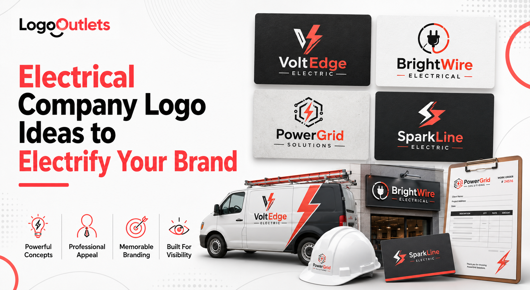
Most electrical businesses already do the hard part right. The work meets code, the service is dependable, and licensing, inspections, and safety compliance are handled correctly.
Yet the logo still looks generic or indistinguishable from every other electrician operating in the same market.
In the electrical industry, trust is not optional. Customers allow contractors into homes, commercial facilities, and regulated systems where mistakes carry real risk.
Before credentials are reviewed or experience is verified, visual cues shape perception. A weak logo signals uncertainty, while a strong logo signals competence, safety awareness, and professionalism immediately.
Trust begins with recognition. When customers repeatedly see the same color palette, logo, and visual tone across trucks, uniforms, websites, and listings, they are more likely to remember the business and view it as reliable.
Research on consumer behavior shows that consistent branding can increase brand recognition by up to 80%, reinforcing trust before any technical evaluation takes place.
That is why electrical company logo ideas are not about decoration or visual trends. They are about perception, credibility, and long-term brand equity in a high-trust trade.
| As branding strategist Marty Neumeier writes,
“Your brand is not what you say it is. It’s what they say it is.” |
This guide explains how electrical businesses use branding strategically to stand apart, earn trust faster, and remain memorable in competitive local markets.
Key Takeaways
- A logo directly impacts trust in electrical services before credentials are verified
- Industry-specific symbolism matters more than artistic flair
- Electrical branding must communicate safety, professionalism, and reliability instantly
- Generic logo templates weaken differentiation in local markets
- Strategic logo design supports long-term growth, not just first impressions
Why Electrical Company Logo Ideas Matter More Than Ever
Electrical services operate in a high-risk and high-trust environment.
Most customers cannot evaluate wiring quality, load calculations, or code compliance before work begins. As a result, credibility is judged long before technical expertise can be verified.
That judgment is visual.
Logos, color systems, and overall presentation act as early trust signals, shaping whether a business appears competent, safety-conscious, and professionally established.
In the electrical trade, where work involves regulated systems, permits, and safety standards, those signals carry disproportionate weight.
A strong logo quickly communicates that a business takes its work seriously.
It becomes shorthand for:
- Technical competence
- Safety awareness and discipline
- Professional operating standards
- Legitimate, established business practices
This behavior is supported by usability and credibility research. Studies referenced by the Nielsen Norman Group show that users form first impressions almost instantly when exposed to visual design elements, and those impressions strongly influence how credibility is perceived. Logos, colors, and symbols are among the first elements processed.
For electrical businesses, this means branding often shapes perception before licenses, reviews, or certifications are considered.
Credentials confirm trust, but visual identity often determines whether trust is granted the chance to form at all.
What Makes Electrical Logos Different From Other Industries?
Electrical branding is fundamentally different from lifestyle or retail branding.
It operates in a risk-based environment, not an emotional or expressive one.
A café can afford to look playful.
A clothing brand can lean into abstraction or trend-driven visuals.
An electrical contractor cannot.
Electrical work involves regulated systems, safety codes, permits, inspections, and real consequences when mistakes occur.
Because most customers cannot evaluate technical quality upfront, branding becomes an early credibility filter. The logo must immediately communicate control, order, and safety awareness, not personality or flair.
That is why effective electrician logo ideas are built around clarity and restraint rather than creativity for its own sake.
Strong electrical logos typically balance three non-negotiable forces:
- Technical Credibility: Visual cues that signal compliance, precision, and competence
- Visual Clarity: clean forms and typography that remain legible on trucks, uniforms, and job sites
- Industry Relevance: symbols, colors, and structure that align with electrical work, not generic service templates
When these elements are present, the logo reinforces the electrician’s branding as professional and dependable.
When they are ignored, electrical logo design often fail. Designers rely on trendy fonts, overused lightning icons, or generic layouts that do not reflect a regulated trade.
The result is branding that looks acceptable on a screen but undermines trust in real-world electrical environments.
Core Elements Behind Professional Electrical Logo Ideas
The strongest professional electrical logo ideas are not created by following design trends.
They are built by understanding how customers interpret visual signals in regulated, safety-critical services.
Every element in an electrical logo must serve a purpose beyond appearance.
Industry-Relevant Symbols
Effective electrical logos reference visual concepts customers already associate with electrical services and safety-regulated work.
Common examples include:
- Lightning or energy symbols, used with restraint and supported by a unique structure
- Circuit paths or simplified wiring traces that suggest technical precision
- Controlled power flow lines that imply order and system logic
- Shield or badge frameworks that reinforce safety and operational discipline
These are not decorative choices.
They exist to help customers instantly categorize the business as a legitimate electrical contractor, not a generic home service provider.
When symbols lack industry grounding, recognition drops, and credibility weakens, especially on vehicles, uniforms, and jobsite signage, where decisions are made quickly.
This is a defining principle behind effective electrical logo design ideas.
Color Psychology in Electrical Company Branding
Color plays a measurable role in how professionalism and reliability are perceived, particularly in service businesses where technical quality cannot be evaluated at first glance.
In electrical company branding, the most effective palettes typically rely on:
- Blue to signal reliability, competence, and professionalism
- Yellow or controlled orange accents to support visibility and safety awareness
- Neutral grays to balance authority without visual aggression
This combination supports safety-focused logo design while maintaining clarity across real-world applications.
The key is restraint. Overusing high-visibility colors creates visual noise and reduces legibility on truck wraps, uniforms, and printed materials.
A well-chosen palette must perform consistently across vinyl, embroidery, signage, and digital platforms, not just on a screen.
Typography That Signals Control
Typography is one of the fastest ways customers judge professionalism, often without realizing it.
Electrical logos benefit from typefaces that feel:
- Structured and intentional
- Legible at a distance and in motion
- Balanced in weight for use on vehicles and equipment
Thin scripts, novelty fonts, or decorative lettering undermine authority and introduce unnecessary doubt.
In contrast, strong sans-serif or industrial-grade serif fonts reinforce professional trade logos by communicating order, control, and operational maturity.
Typography should hold up on trucks moving at speed, uniforms viewed from across a jobsite, and signage exposed to weather and wear. If the type fails in those conditions, the logo fails in practice.
| Why This Matters:
When these elements work together, symbolism, color, and typography, the logo becomes more than a visual mark. It becomes a functional business asset that supports recognition, credibility, and consistency across every customer touchpoint. This is the difference between a logo that looks acceptable and one that actively supports electrical contractor branding in the real world. |
What Are the Most Common Electrical Logo Design Mistakes?
Most electrical logos fail for the same reason.
They are designed in isolation, without considering how branding actually functions in a regulated, service-based trade.
The most common mistakes include:
- Generic or templated symbols: Overused lightning icons, stock vectors, and clip-art graphics signal convenience, not credibility. When a logo looks interchangeable with dozens of others, recognition drops, and the business blends into the background.
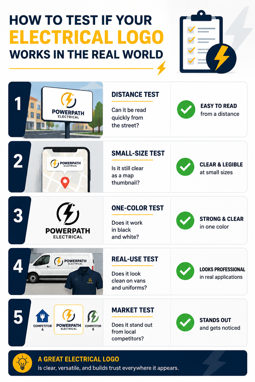
- Designs that collapse at real-world sizes: Logos that look acceptable on a website often fail on trucks, uniforms, yard signs, and Google Business Profile thumbnails. Fine details disappear, shapes blur, and brand recall suffers.
- Low-contrast color choices: Weak contrast and thin lines reduce legibility from a distance or in motion. This is one of the fastest ways an electrician’s branding loses impact on service vehicles and jobsite signage.
- Branding that mismatches the service tier: Logos that feel casual or “handyman-style” undermine credibility for businesses offering licensed electrical contractor services, especially in commercial or industrial environments.
- Ignoring how the logo will be deployed: Designing without considering vans, uniforms, estimates, invoices, and safety documentation leads to inconsistent presentation and diluted professional trade logos.
These mistakes rarely happen out of neglect. They happen when businesses rely on templates, DIY tools, or designers unfamiliar with electrical work. The cost shows up quietly in weaker recall, lower trust at first glance, and reduced effectiveness across the most visible brand touchpoints.
This is how electrical contractor branding gets diluted, even when the actual service quality is high.
Types of Electrical Logo Design Ideas That Actually Work
Below are logo styles proven to perform in trade-based industries.
| Logo Type | Best Use Case | Why It Works |
| Wordmark | Established local companies | Clear, professional, easy to recognize |
| Icon + Text | Growing electrical contractors | Flexible across platforms |
| Badge Style | Union or legacy businesses | Signals tradition and trust |
| Minimal Symbol | Modern service brands | Clean and scalable |
This framework aligns with service business logo design best practices used across licensed trades.
Who Needs Professional Electrical Logo Ideas the Most?
Branding pressure does not appear randomly in electrical businesses.
It surfaces at specific growth and credibility thresholds where visual perception begins to influence buying decisions before reputation has time to do the work.
The groups that benefit fastest from professional electrical logo ideas include:
- New electrical contractors entering competitive markets: Recognition must be built quickly. A strong logo helps establish legitimacy before reviews, referrals, and local visibility catch up.
- Businesses expanding into commercial electrical services: Commercial clients expect higher standards of professionalism. Branding that looks residential or informal can quietly disqualify a contractor before a proposal is considered.
- Residential electrical services aiming to raise pricing: Pricing power depends on perceived professionalism. A refined logo reduces price shopping and supports higher-value positioning.
- Companies transitioning from solo operators to teams: Growth introduces trucks, uniforms, and multiple technicians. Consistent branding becomes essential for credibility and control across every customer interaction.
In each case, professional electrical logo ideas strengthen electrical contractor branding by improving recognition, perceived professionalism, and consistency at the exact moments customers form first impressions.
Electrical Logo Design Ideas That Support Long-Term Growth
The strongest electrical logos are not designed for today’s website.
They are designed for scale, consistency, and repeat exposure across every environment where trust is evaluated.
Growth-ready electrical logo design ideas account for how branding performs when a business adds technicians, vehicles, service areas, and higher-value contracts.
That means planning for visibility and clarity across:
- Fleet branding and truck wraps: Logos must remain legible at a distance and in motion. Thin lines, low contrast, or excessive detail fail when viewed on moving vehicles or parked at job sites.
- Local digital listings and map thumbnails: On Google Business Profile and map-pack results, logos are reduced to small icons. Designs that rely on fine detail or subtle color differences lose recognition instantly.
- Invoices, estimates, and proposal documents: Branding carries authority in bid packages and pricing discussions. A professional logo reinforces legitimacy before scope, pricing, or credentials are reviewed.
- Safety documentation and jobsite materials: Electrical businesses operate in regulated environments. Logos must integrate cleanly into safety signage, compliance documents, and internal materials without visual breakdown.
Logos created only for website headers often collapse in these conditions. Lines disappear, contrast weakens, and recognition drops precisely where exposure matters most.
Strategic electrical logo design ideas anticipate growth by enforcing consistency, legibility, and adaptability across physical and digital touchpoints.
This is how electrical company branding supports expansion instead of becoming a limitation as the business scales.
Real-world Scenario: When a Logo Starts Costing Real Business
Consider a growing electrical contractor that began as a one-person operation.
The logo was created quickly using a template. It looked acceptable on a website and business card, so it stayed.
The issues surfaced when the business crossed its first real growth threshold.
Additional technicians were hired.
Service vans were added to the fleet.
Commercial clients began requesting formal proposals and bid documents for permit-driven work.
That is when the logo stopped performing.
- Thin lines disappeared on truck wraps and jobsite signage
- Colors lost contrast on uniforms and vinyl applications
- The symbol became indistinct in Google Maps and local listing thumbnails
- Proposal documents looked informal next to established competitors
Nothing changed about the quality of the electrical work.
Installations remained code-compliant.
Safety standards were still met.
What changed was perception.
Commercial prospects took longer to respond.
Price objections became more frequent.
The business was increasingly grouped with smaller or less established operators.
After revisiting the logo with scale and deployment in mind, the difference was immediate:
- Vehicles became readable and recognizable from the street
- Branding stayed consistent across invoices, uniforms, and estimates
- Proposal documents carried more authority during bidding
- The company was no longer mistaken for a solo or unlicensed operation
The service never changed.
The presentation finally matched the reality of the business.
This is how branding influences outcomes in electrical services.
Not through marketing hype, but through consistency at the exact moments where trust decisions are made.
| Note:
If a logo fails on a service van, in a map-pack thumbnail, or on a proposal, it fails as a business tool. |
How Electrical Logos Reinforce Safety and Compliance
Electrical work operates in a regulated, safety-critical environment.
Branding does not replace licensing, inspections, or code compliance, but it plays a clear role in how professionalism and discipline are perceived before work begins.
In electrical services, visual order signals operational order.
A well-designed logo reinforces that a business takes structure, standards, and process seriously.
This matters in an industry where customers often lack the technical knowledge to evaluate safety practices upfront and instead rely on visible cues.
Strong electrical logos support safety and compliance by:
- Licensed electrical contractor branding: Clean, structured logos signal legitimacy and alignment with regulated trade expectations, not casual or handyman-level work.
- Industry-compliant logo design cues: Balanced typography, disciplined color use, and controlled symbolism mirror the precision expected in code-compliant electrical installations and documentation.
- Safety awareness across customer touchpoints: Logos that remain clear on vehicles, uniforms, jobsite signage, and safety documents reinforce consistency and attention to detail in environments where mistakes carry real consequences.
A clear logo does not claim compliance but reflects it.
When branding looks orderly, legible, and intentional, customers are more likely to believe the business follows defined processes and professional standards.
That perception influences trust for homeowners deciding who enters their property and for commercial clients evaluating contractors for regulated facilities.
In electrical services, credibility is not only built through work performed.
It is also established through how clearly responsibility and professionalism are communicated at first glance.
Why Generic Logo Templates Hurt Electrical Businesses
Generic logo templates create problems that are easy to overlook but expensive over time.
In electrical services, where trust and recognition drive first contact, these issues compound quickly.
Template logos introduce three silent risks:
- Loss of differentiation at the local level: Stock lightning bolts, plugs, and badge icons are reused across marketplaces. When multiple electricians in the same area share similar visuals, customers struggle to tell businesses apart on trucks, yard signs, and map-pack listings.
- Weak memorability at key decision points: Template designs rely on predictable shapes and layouts. They are easy to overlook when seen briefly on service vehicles, uniforms, or Google Business Profile thumbnails.
- Erosion of professional perception in a regulated trade: Visual sameness suggests shortcuts. In an industry governed by permits, inspections, and safety standards, templated branding can quietly position a business as entry-level, even when service quality is high.
In trade industries, sameness creates perception risk.
Not safety risk, but the risk of being overlooked, miscategorized, or confused with lower-tier operators.
That is why logo ideas for electricians must be tailored to the business, the market, and the environments where branding is seen most often. Templates may save time upfront, but they cost credibility where it matters most.
How Professional Trade Branding Builds Pricing Power
Pricing power is rarely created by charging more.
It is created by reducing doubt.
In industries where customers face complexity and technical uncertainty, clarity becomes a competitive advantage.
Research highlighted by Forbes explains that simplicity and clarity increase trust, strengthen loyalty, and help customers move from hesitation to decision.
When experiences feel clear and well-structured, customers are more confident in their choices and less resistant to commitment. This principle applies directly to electrical services.
Most customers cannot evaluate wiring quality, load calculations, or code compliance before work begins. As a result, they rely on visible signals to judge professionalism. Clear and consistent branding becomes one of those signals.
When electrical businesses invest in professional trade branding, the impact shows up in measurable ways:
- Fewer price objections during estimates and proposals: Clear branding reduces uncertainty. Customers spend less time questioning legitimacy and more time evaluating scope and fit.
- Higher perceived value at first contact: Consistent logos, colors, and typography shape expectations before credentials or reviews are reviewed in detail.
- Stronger referral confidence: Customers are more willing to recommend businesses that look organized and credible because their own reputation is attached to that referral.
Professional trade branding does not replace licensing, inspections, or quality workmanship. It supports them, especially when developed through a custom logo design agency that prioritizes clarity and consistency over trends.
By presenting clarity instead of visual noise, branding reinforces confidence at the exact moments where pricing decisions are made.
In electrical services, that confidence often determines whether a quote is accepted, negotiated, or ignored.
Conclusion
Strong electrical company logo ideas do more than decorate marketing materials.
They establish credibility in a trade where safety, compliance, and professionalism matter before any work begins.
A well-designed logo signals order, discipline, and legitimacy. It supports recognition across trucks, uniforms, proposals, and local listings, reinforcing trust at the exact moments customers decide who feels reliable enough to call.
Electrical businesses that treat branding as a strategic asset are more likely to stand out, command confidence, and avoid being miscategorized as low-tier or interchangeable service providers.
In markets where trust determines the first call, branding functions as a silent salesperson.
The practical rule is simple.
If a logo is not legible on a service van, recognizable in map-pack thumbnails, and credible on proposals, it is not doing its job.
The right logo does not shout but reassures.
Not sure if your current logo is helping or hurting your business?
A quick professional review can reveal whether it’s working across vehicles, listings, and proposals. Reach out to Logo Outlets at info@logooutlets.com or call 201-820-6598 to start the conversation.
FAQs
Why should I choose Logo Outlets for electrical logo design?
Logo Outlets designs electrical logos for real-world performance, not just visual appeal. Every logo is built to work across service vehicles, uniforms, proposals, and local search listings, ensuring clarity, safety perception, and long-term brand consistency.
Does Logo Outlets design logos specifically for electricians and contractors?
Logo Outlets specializes in trade-aware branding, creating logos that align with electrical industry expectations, permit-driven work, safety-focused services, and professional credibility requirements.
What are the best electrical company logo ideas?
The best electrical company logo ideas focus on structure and clarity rather than trends. Effective designs are easy to recognize at a distance, scalable across vehicles and signage, and clearly associated with electrical services.
What makes a good electrical logo?
A good electrical logo is simple, legible, and consistent. It uses disciplined typography, strong contrast, and restrained symbolism, so it remains recognizable on trucks, uniforms, proposals, and local listings.
What do common electrical logo symbols mean?
Electrical logo symbols often communicate power, control, and technical discipline. Elements like simplified lightning, circuit paths, or structured badges suggest precision and reliability when used thoughtfully rather than as generic icons.
Why is professional electrical logo design important?
Professional electrical logo design matters because customers cannot evaluate technical quality upfront. A well-designed logo establishes credibility early, before reviews, credentials, or estimates are closely examined.
Where can I evaluate strong electrical contractor logo examples?
Electrical contractor logo examples should be evaluated in real-world contexts, such as service vehicles, uniforms, jobsite signage, proposal documents, and local map-pack thumbnails, not just on websites or mockups.
How do electrical logo design services differ from general logo design?
Electrical logo design services must account for regulated work environments, safety perception, and physical deployment across vehicles, signage, and documentation. General logo design often overlooks these practical requirements.
Should I hire a logo designer for an electrician business instead of using a template?
Hiring a logo designer for an electrician business reduces the risk of duplication, poor scalability, and weak recognition. Templates often fail in local markets where multiple contractors use similar stock visuals.
What is a custom electrical logo design, and why does it matter?
Custom electrical logo design creates a unique identity tailored to the business, service scope, and growth stage. It prevents confusion with competitors and supports long-term recognition as the business scales.