A logo can look perfect on a laptop screen and fall apart the first time it meets a truck door.
That is the part many new construction founders do not see coming. The sketch looks strong. The mockup looks sharp. The colors feel bold. Then the logo gets printed on a magnet, stitched on a shirt, resized for a Facebook profile, slapped onto a white pickup, and half-covered in dust by Thursday afternoon.
Suddenly, those construction business logo ideas do not feel so practical
A construction logo has a harder life than most logos. It has to survive mud, sun, rain, glare, distance, movement, vinyl cuts, embroidery, invoices, proposals, websites, jobsite signs, and tiny profile icons. It cannot only look good in a design preview. It has to keep working in the places where construction businesses are actually seen.
Key Takeaways
- The best construction logo ideas are designed for real-world surfaces, not just screens.
- Simple shapes and readable type usually survive real-world use better.
- The right logo file formats prevent blurry trucks, signs, and uniforms.
- A strong logo system gives founders more control before production.
Construction Logo Ideas for Trucks Signs and Sites
The best construction company logo ideas begin with a simple question: where will the logo live?
Not in a mood board. Not only on a website. Not only on a black background inside a designer’s presentation.
A construction logo lives on hard-working surfaces. Painted metal. Vinyl. Mesh banners. Proposal covers. Cotton shirts. Safety vests. Equipment decals. Email signatures. Social media thumbnails. Sometimes it lives under dust, glare, scratches, or poor lighting.
That reality changes the design brief.
Steve Jobs once said
“Design is not just what it looks like and feels like. Design is how it works.”
That idea matters here. A construction logo is not only judged by how it looks in a perfect mockup. It is judged by how clearly it works on trucks, uniforms, signs, proposals, and job sites.
A thin line may look elegant on a screen, but it can vanish on a truck from across the street. A detailed roofline may look clever in full size, but it can turn into a dark blur on a hat. A fancy font may feel unique until a homeowner cannot read the company name while the truck passes by.
A practical logo is not plain. It is disciplined.
It knows what to leave out.
That is why early-stage founders should avoid collecting random inspiration without thinking about application. A good logo idea for a boutique café does not need to survive the same conditions as a construction company logo. A construction logo design has to be built with pressure in mind.
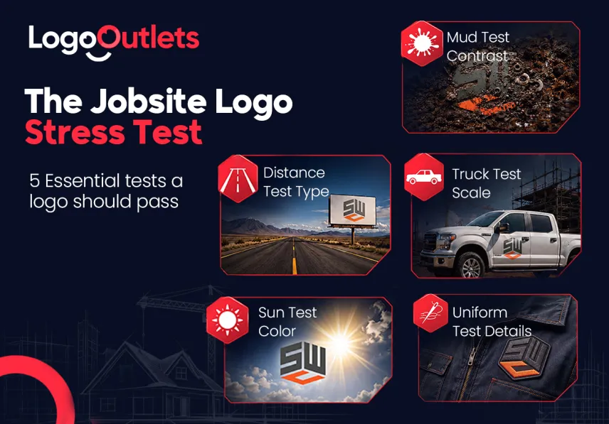
Can Your Logo Survive the Jobsite?
A jobsite does not care how nice the logo looked in the first presentation.
It tests everything.
Mud tests contrast. Sun tests color. Distance tests typography. Truck doors test proportions. Uniforms test line weight. Signs test simplicity. Social media tests recognizability. Print vendors test whether the files were prepared correctly.
The logo either holds up or it starts showing weak spots.
A founder may notice it in small moments. The logo looks too small on the truck. The icon disappears on black shirts. The orange looks different on the sign than it does on the website. The printer asks for a vector file and nobody knows what that means. The designer sends a PNG, but the sign shop wants something else.
This is not just a design inconvenience. It slows production, creates inconsistent materials, and makes the brand feel less controlled.
A construction logo should be treated like a field asset. It needs strength, flexibility, and clear instructions.
What Makes a Logo Survive Truck Doors?
A truck door is one of the toughest tests for a construction logo.
It is moving. It reflects light. It gets dirty. It may be parked near other trucks. It may be seen for only a few seconds. The logo has to be understood quickly, even by someone who is not trying very hard to read it.
A truck-ready logo usually has four traits.
First, the name is readable. The company name matters more than the cleverness of the icon. If the name cannot be read from a distance, the truck becomes decoration instead of marketing.
Second, the shape is simple. Over-detailed tools, tiny windows, thin beams, and complex outlines can disappear on curved metal or vinyl.
Third, the contrast is strong. A dark logo on a dark truck struggles. A pale logo on a white truck fades. A good designer thinks about background colors before production.
Fourth, the layout is flexible. A wide truck door may need a horizontal version. A hard hat may need a compact version. A social icon may need a symbol-only version. One fixed layout rarely solves every use.
This is where branding for construction companies becomes practical. It is not only about colors and style. It is about making sure the business looks recognizable wherever clients encounter it.
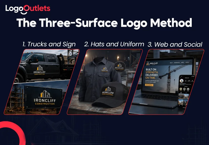
The Three-Surface Logo Method
A useful construction logo can be judged through three surfaces: metal, fabric, and screen.
This framework keeps the design grounded. Instead of asking whether the logo looks attractive in isolation, it asks whether the logo can work across the surfaces that matter most.
- Metal
Metal means truck doors, trailers, equipment, toolboxes, and signs.
On metal, the logo needs strong contrast, clean edges, and a layout that can handle glare. Details should not rely on tiny lines. Shapes should still read when viewed from a distance.
- Fabric
Fabric means uniforms, hats, safety vests, jackets, and embroidered patches.
On fabric, small gaps can close. Thin lines can break. Gradients may not translate well. A logo with too much detail can become messy once stitched.
- Screen
Screen means websites, Google Business profiles, social media, digital proposals, email signatures, and ads.
On screens, the logo needs a responsive system. The full logo may work on a website header, but a small icon or initials may work better for a profile image.
The strongest construction logo design is not one perfect image. It is a small system that adapts without losing recognition. Even a premium construction logo has to prove itself across these real surfaces before it becomes useful for the business.
How Should Logo File Formats Be Delivered?
A construction founder should not walk away with only one JPG.
That is one of the most common handoff mistakes. The logo looks finished, but the business cannot actually use it properly. The moment a sign shop, printer, embroiderer, or web developer asks for a different file, confusion starts.
Logo file formats matter because each one has a job.
A vector logo design is usually the master version. Vector files are built from paths and shapes, which makes them useful for scaling a logo from small to large without the same pixel problems that happen with raster images.
Raster files, like PNG or JPG, are still useful. They are good for everyday digital use, previews, websites, and social media. But they should not be the only files a construction company receives.
Here is a simple way to think about it.
| File Type | Best Use | Why It Matters | Common Mistake |
| AI or editable source | Designer edits | Keeps the master artwork flexible | Not requesting the source file |
| EPS | Signs, vendors, print | Common for production teams | Sending only a JPG to a sign shop |
| SVG | Websites and digital use | Scales cleanly on screens | Uploading a blurry PNG instead |
| Print sharing and proofing | Easy to send and review | Using low-quality exports | |
| PNG | Web, social, transparent background | Useful for everyday digital needs | Using it for huge signage |
| JPG | Simple previews or photos | Easy to open and share | Using it as the main logo file |
A founder does not need to become a file expert. But they should know enough to ask the designer for a complete logo package, especially when comparing the construction company logo design cost against what the business will actually receive.
The package should include color versions, black versions, white versions, horizontal versions, stacked versions, and icon-only versions. It should also include clear notes on where each file should be used.
How Can You Field-Test Your Logo?
Before a construction logo is approved, it should be tested in realistic conditions.
Not after production. Before.
A practical field test can prevent expensive reprints, awkward truck wraps, and uniforms that do not look like the website.
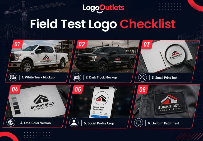
Use this checklist before signing off.
- Place the logo on a white truck mockup.
- Place it on a dark truck mockup.
- Print it small on a business card.
- View it from across the room.
- Test it in one color.
- Place it inside a social profile circle.
- Mock it up on a hat or uniform patch.
- Check whether the company name is still readable.
3M reports that vehicle advertising can generate 30,000 to 70,000 daily vehicular impressions, which is why a construction logo should be tested on truck mockups, small print, uniforms, and signage before money is spent on production.
Do This, Not That for a Construction Logo
| Do This | Do Not Do This |
| Keep the construction logo simple enough to work on hats, trucks, signs, and uniforms. | Do not add too many small details that turn into visual noise. |
| Build recognition with one clear mark or symbol. | Do not try to show every service in the logo. |
| Choose colors that stay readable in print, digital, and outdoor use. | Do not pick colors based only on personal taste. |
| Create a logo that stands apart from local competitors. | Do not copy the same roofline, crane, or block font everyone else uses. |
| Make sure the final files are ready for real-world use. | Do not accept a cheap logo without proper formats or production testing. |
| Design the logo around function, visibility, and brand recall. | Do not make the logo look impressive only at full size. |
The Moment the Logo Leaves the Screen
Picture a new construction founder getting ready for the first real round of branded materials.
The truck needs lettering. The website needs a header. The estimator needs business cards. The crew wants shirts. A yard sign would help on active projects. The social profile still has a cropped logo that looks awkward in a circle.
This is the moment a logo either feels finished or fragile.
A fragile logo creates questions everywhere. Which file goes to the sign vendor? Why does the black version look different from the blue version? Why does the icon disappear on the shirt? Why does the website logo look fuzzy? Why does the truck proof look stretched?
A finished logo system creates calm.
The founder has a folder with the right files. The designer has included usage notes. The sign shop has vector artwork. The web person has SVG and PNG files. The printer has a clean PDF. The embroidery vendor has a simplified version that can actually stitch well.
That is not overthinking. That is basic readiness.
The logo is no longer just an idea. It is a working tool.
How Should Founders Explain Their Logo Vision?
A better logo starts with a better brief.
Many founders ask for “something strong” or “something modern.” That is understandable, but it is not enough. A designer needs the practical environment, not only the mood.
A helpful construction logo brief should include:
- The type of construction work the company does
- The type of clients the company wants
- The surfaces where the logo will appear first
- The truck color or vehicle style
- The preferred brand tone
- Competitor logos to avoid copying
- Any symbols that feel overused in the local market
- Required file formats for vendors
A founder using a construction logo creator can still use this same thinking before choosing a direction, because the goal is not just to create a mark but to prepare a logo that can work in the real world.
This is how construction company branding becomes less mysterious. It becomes a practical set of decisions that help the business show up consistently.
Logo Research Without Copying the Market
Gathering inspiration is useful. Copying is not.
A founder looking through construction logo design ideas should study why certain logos work, not just what they look like. Is the font readable? Is the icon simple? Does the color contrast well? Does the mark feel specific to the company’s niche? Could it survive on a truck door?
Inspiration should lead to questions, not imitation.
For example, a roofing company may notice that roofline symbols are common. Instead of using the same shape, the founder could explore a stronger wordmark, a custom letterform, or a subtle angle that suggests shelter without becoming another roof icon.
An excavation company may not need a literal bulldozer. Heavy typography, grounded proportions, and a strong color system may say enough.
A remodeling company may want warmth and craft rather than heavy industrial cues. A commercial contractor may need structure and precision. A specialty trade may need clarity above everything else.
Good inspiration helps the company find its own lane.
A Strong Logo Lives Beyond the Screen
A construction logo should not be judged only by how it looks in a clean preview.
It should be judged by how it performs after it leaves the screen.
Can it be read on a truck door? Can it survive sun glare? Can it stay clear on a dusty sign? Can it shrink into a social icon? Can it stitch onto a shirt? Can a vendor use the files without chasing the founder for better artwork?
Those are the questions that turn design into a working asset.
The strongest construction logo ideas are not always the loudest or most complicated. They are the ones built with real use in mind. They respect the truck, the sign, the screen, the uniform, and the customer’s quick glance.
For founders ready to turn a rough idea into a field-ready identity, Logo Outlets can help create a practical construction logo system with usable files for trucks, signs, print, and digital use. Contact 201-820-6598 or info@logooutlets.com to get started.
FAQ
What are good construction logo ideas?
Good construction logo ideas are simple, readable, and built for real surfaces like trucks, signs, uniforms, websites, and business cards.
What makes construction logo design effective?
Effective construction logo design balances strong typography, simple shapes, practical colors, and flexible layouts that work across print and digital use.
Which logo file formats does a contractor need?
A contractor should usually request editable source files, EPS, SVG, PDF, PNG, and JPG versions for different vendors and platforms.
Why is vector logo design important?
Vector logo design is important because it helps the logo scale cleanly for large signs, truck wraps, and other production needs.
What colors work best for construction logos?
Strong construction logo colors often include charcoal, navy, gray, yellow, orange, green, or red, depending on the company’s position and surfaces.
Should a construction logo include tools?
A construction logo can include tools, but they should be simple and distinctive. Overused hammers, roofs, and bulldozers can make a brand look generic.
How does branding help a construction company?
Construction company branding keeps the logo, colors, files, signs, vehicles, and digital materials consistent so the business feels easier to recognize.
How can a logo work better on truck doors?
A logo works better on truck doors when the name is readable, the contrast is strong, and the layout is simple enough to see from a distance.
What should a founder ask before approving a logo?
A founder should ask whether the logo works on metal, fabric, and screens, and whether the final package includes production-ready files.
Can a logo service help with field-ready files?
Yes. A professional logo service should provide practical logo versions and file guidance so the design can be used across trucks, signs, print, and digital platforms.