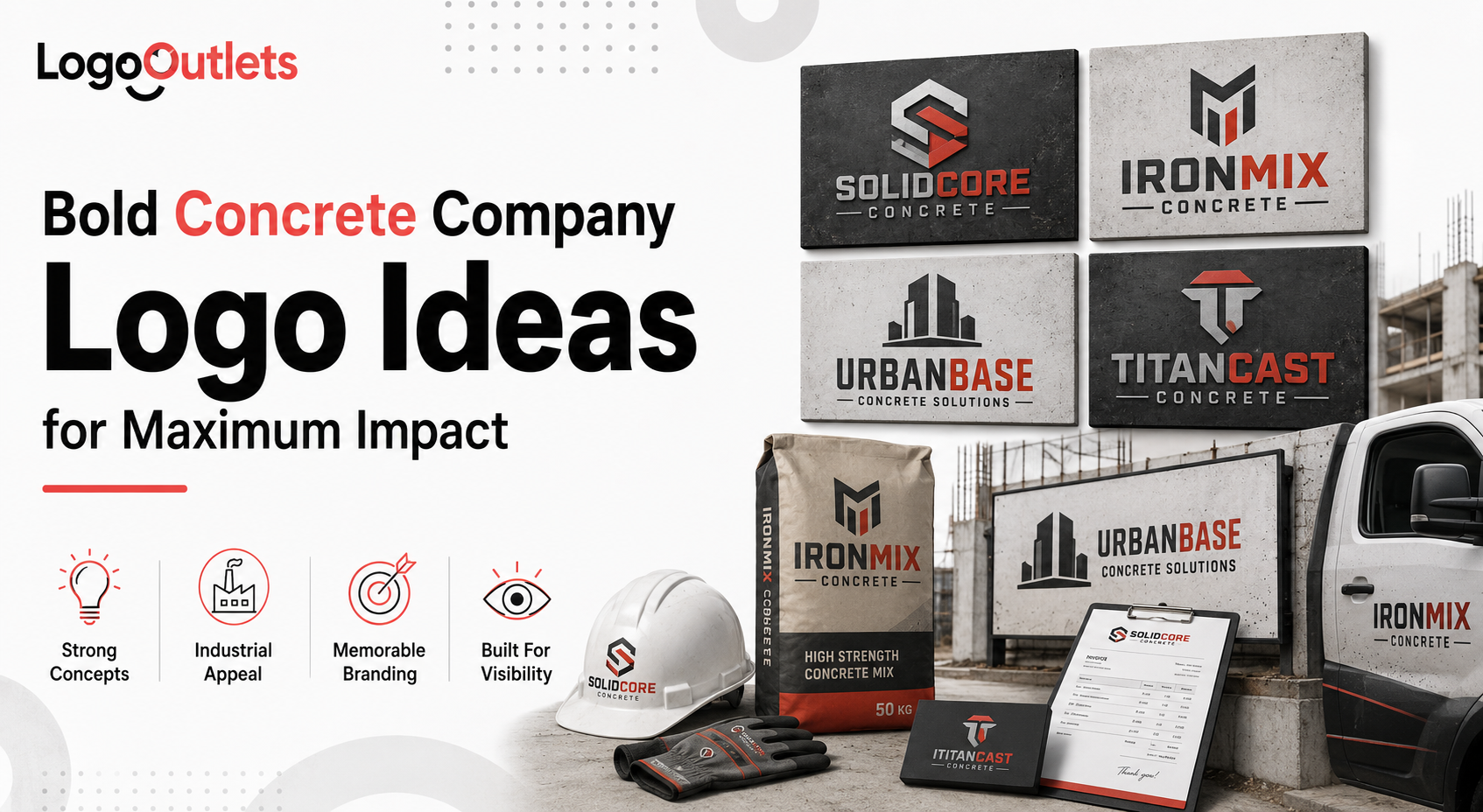
Unprofessional branding is one of the quietest revenue killers in the concrete and construction industry.
Most concrete businesses deliver solid work on-site but look forgettable or outdated on trucks, equipment, proposals, and online listings.
In a traditional industry where credibility determines who gets shortlisted, a weak logo sends the wrong signal before a single bid is reviewed.
Research published in Scientific Reports shows that both social and non-social visual cues shape trust-related judgments early, even when proof of performance is unavailable, confirming how quickly decisions form before real experience is considered.
This is where concrete company logo ideas stop being a design discussion and become a business decision.
As Seth Godin said,
“People do not buy goods and services. They buy relations, stories, and magic.”
In concrete and construction, that trust is often established visually on a truck door, a proposal header, or a job-site sign long before a conversation ever happens.
This guide breaks down bold, practical logo strategies for concrete companies that want to look credible, established, and worth choosing without gimmicks.
Key Takeaways
- Concrete company logos influence trust and credibility before a quote or proposal is reviewed.
- Effective logos prioritize clarity, durability, and real-world usability over visual trends.
- Branding in construction functions as a risk-reduction tool, not a marketing accessory.
- Logos must perform consistently across trucks, job sites, proposals, and digital platforms.
- Professional branding helps concrete businesses get shortlisted, remembered, and taken seriously.
Why Do Concrete Companies Struggle With Professional Branding?
Concrete businesses often grow through referrals, repeat contracts, and long-term commercial relationships.
Early success comes from workmanship and reliability, not visibility.
As a result, branding rarely feels urgent until the company begins competing outside its referral circle.
Operational priorities take over:
- Time and budget are focused on crews, equipment, and job execution
- Logos are self-made, outdated, or borrowed from competitors
- Visual identity stays unchanged even as the business scales
The problem appears when growth outpaces perception.
It is common to see a construction company handling commercial construction and residential construction projects worth six or seven figures still presenting itself with a logo that looks small, temporary, or improvised.
That visual mismatch raises red flags during bid reviews, vendor shortlisting, and pre-qualification checks.
The impact is not cosmetic.
It directly affects:
- Trust during early evaluations
- Perceived reliability at scale
- Overall professionalism in high-risk decisions
Strong concrete company branding closes this gap by aligning how the business looks with the level at which it actually operates.
What Makes Concrete Company Logo Ideas Truly Effective?
Effective concrete company logo ideas are built on clarity and function, not creative novelty, which is why many contractors work with a custom logo design agency that understands real-world construction constraints.
In construction, a logo is evaluated in seconds and often at a distance, on trucks, safety gear, job-site signage, and proposal headers.
A high-performing concrete construction logo communicates three things immediately:
- Strength and long-term durability
- Experience and capacity as a concrete contractor operating in industrial services
- Stability that feels established, not experimental
The most reliable logos in this industry share consistent, practical traits:
- Simple forms that remain legible at scale and in motion
- Confident proportions that suggest structure and control
- Minimal symbolism rooted in construction fundamentals rather than decorative trends
These principles apply whether the business focuses on cement supply, foundation work, or large-scale infrastructure.
When a logo aligns with how a construction company actually operates, it supports credibility during bid reviews, shortlisting, and early trust evaluations.
What Logo Styles Work Best for Concrete and Cement Companies?
Concrete and cement companies operate in a high-risk, low-margin environment where credibility is assessed quickly and often visually.
The most effective logo styles are not chosen for originality.
They are chosen because they hold up under real-world conditions and communicate capability without explanation.
The styles below consistently perform best in construction branding and industrial branding because they align with how concrete businesses are evaluated in practice.
Bold Typography That Commands Attention
Typography carries more weight in construction branding than icons because the company name is what gets remembered and referenced.
On trucks, safety helmets, job-site signage, and proposal headers, typography must stay legible at a distance, in motion, and in one color.
Bold typography works because:
- It stays readable on truck doors, PPE, and yard signs
- It communicates authority and scale without relying on symbols
- It feels established and permanent rather than experimental
A professional Construction Logo Design often succeeds with typography alone, especially for concrete companies that rely on repeat recognition across multiple job sites.
| Best suited for:
Established concrete contractors, ready-mix fleets, and companies competing for commercial bids. |
Industrial and Minimalist Logo Structures
An industrial logo should feel engineered, not expressive.
In construction, buyers associate structure and restraint with operational discipline and reliability.
High-performing industrial logo design choices typically include:
- Straight lines that suggest control and precision
- Heavy strokes that reproduce well in decals and embroidery
- Balanced spacing that maintains clarity at scale
A minimalist construction logo removes unnecessary elements so the company name remains the focal point.
This reduces confusion, avoids visual clutter, and improves recognition in environments where logos are scanned.
| Best suited for:
Concrete companies focused on commercial construction, infrastructure work, and long-term contracts where professionalism outweighs personality. |
Geometric Forms and Foundation Symbolism
Geometry aligns naturally with construction because it mirrors how concrete work is planned, measured, and executed.
A geometric logo communicates order, precision, and repeatability, qualities buyers associate with dependable execution.
Foundation symbolism reinforces stability without relying on overused clichés like hammers, trowels, or generic building icons.
When done correctly, it suggests structural competence rather than decoration.
This approach works particularly well for cement company logo ideas and infrastructure-focused brands where scale, longevity, and technical capability matter more than visual flair.
| Best suited for:
Cement suppliers, foundation specialists, and companies that are positioning themselves for large-scale or long-term projects. |
How Color Psychology Shapes Concrete Branding
Color choices in construction branding are not about taste or preference.
They function as visual risk signals in an industry where buyers are trained to avoid uncertainty.
In concrete and construction, colors are evaluated quickly on trucks, equipment, safety gear, job-site signage, and bid documents.
The wrong palette can make a capable company look disorganized or undersized before any work is reviewed.
A gray construction logo is widely associated with:
- Structural strength and permanence
- Neutrality that does not compete with job-site environments
- Industrial competence that feels practical rather than promotional
Gray also performs well on concrete surfaces, machinery, and uniforms, where contrast and legibility matter more than expression.
Blue construction branding reinforces:
- Trust during early evaluations
- Safety awareness and operational discipline
- Professional standards expected by developers and commercial clients
Blue is commonly read as corporate and organized, which helps concrete companies appear compliant and reliable during bid reviews and shortlisting.
An industrial color palette typically relies on muted neutrals, dark blues, charcoal tones, and a limited accent color.
This approach keeps the brand grounded, legible, and credible across both commercial bids and public-facing materials.
High-saturation or experimental colors should be used with restraint.
While bright tones are effective for safety and visibility, overusing them in core branding can unintentionally reposition a concrete company as informal, residential-only, or inexperienced.
The strongest palettes balance psychology with practicality by remaining clear in one color, readable at distance, and consistent across every surface where the brand appears.
What Does the Data Say About Concrete Logo Design and Business Growth
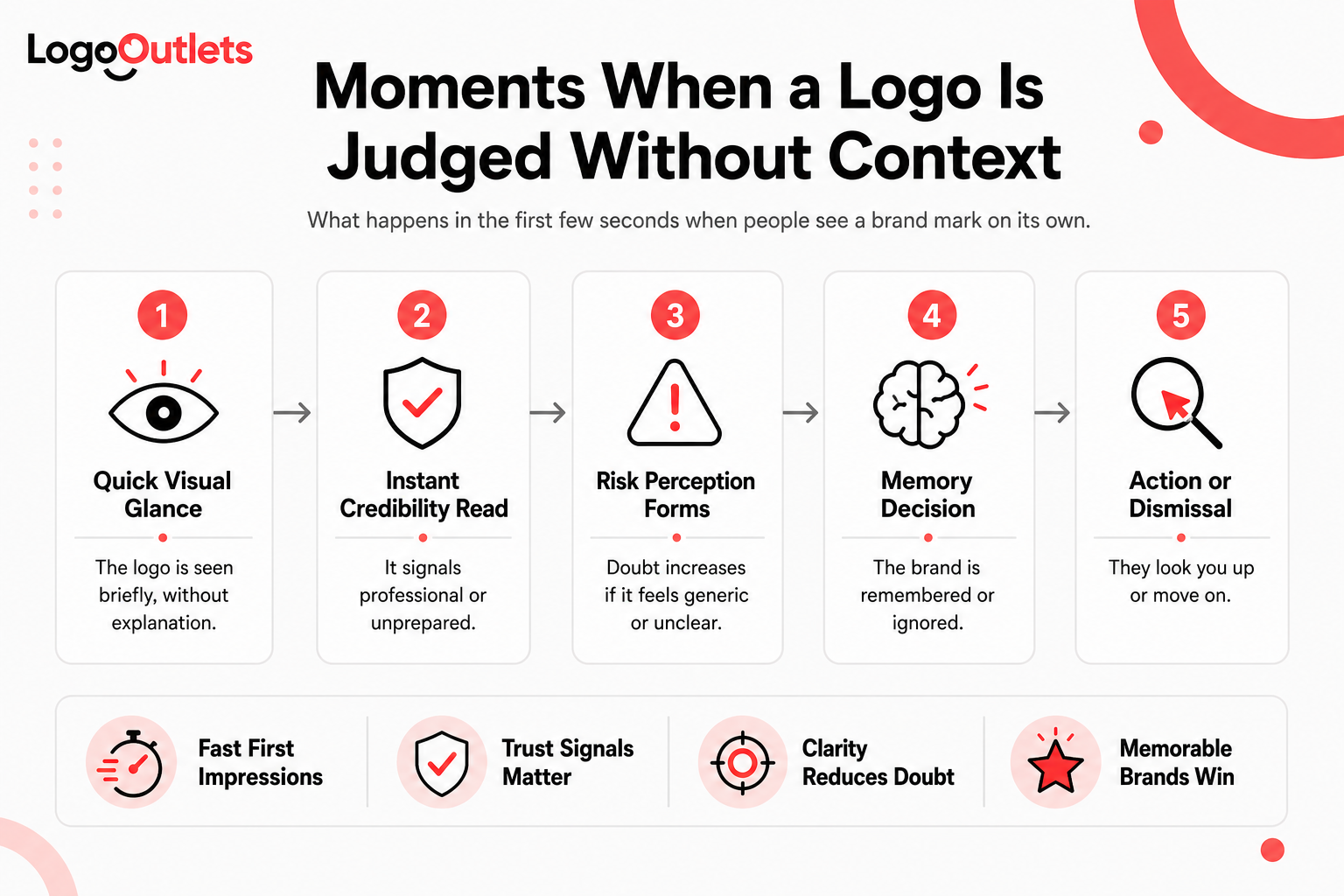
Branding influences how risk, credibility, and professionalism are perceived long before a concrete contractor is evaluated on price or experience.
In construction, where decisions are cautious and stakes are high, perception directly affects who gets shortlisted and who gets ignored.
Research summaries on logo and visual branding indicate that strong visual presentation plays a decisive role in shaping consumer confidence, with credibility judgments being influenced by visual cues in up to 75% of cases.
This does not mean a logo replaces experience.
It means a professionally designed logo signals that a company invests in its presentation, systems, and long-term operation, which reduces perceived risk during early evaluation.
For a concrete contractor, the business impact is practical and measurable:
- A professional concrete company logo reduces friction during initial screening and bid reviews
- Clear brand recognition shortens decision cycles by making the company easier to recall and verify
- Perceived risk drops before contact, increasing the likelihood of callbacks and follow-up conversations
In an industry where many firms offer similar capabilities, visual credibility becomes a differentiator that supports growth rather than a cosmetic upgrade.
What This Looks Like in the Real World
Consider a mid-sized concrete contractor operating across commercial construction and residential construction projects.
The company delivers reliable work, maintains experienced crews, and has built its reputation largely through referrals and repeat clients.
Over time, growth begins to plateau.
A closer look reveals a consistent pattern.
During bid submissions and early-stage inquiries:
- The website appears dated compared to competitors
- Truck branding lacks consistency across the fleet
- The logo looks small-scale and unrefined rather than established
Nothing is operationally broken.
But the brand is not reinforcing confidence during early evaluation.
After investing in concrete company logo ideas that focus on clear typography, a restrained industrial color palette, and consistent application across trucks, proposals, and digital touchpoints, perception starts to shift.
Gradually:
- Follow-up conversations after bid submissions become more frequent
- Prospects reference the company by name rather than by description
- Early discussions move faster toward scope, timelines, and capacity
The quality of work remains the same.
What changes is the alignment between how the business operates and how it appears.
Branding in construction rarely creates demand on its own.
Its primary role is to reduce doubt, shorten evaluation time, and signal readiness for larger opportunities.
Why This Scenario Matters
- It reflects how most concrete businesses actually grow
- It shows branding as a risk-reduction mechanism, not a marketing gimmick
- It connects visual identity directly to shortlisting, bid reviews, and early decision moments
For concrete companies looking to scale beyond referrals, this alignment often determines whether they are seriously considered or quietly passed over.
Concrete Logo Design Elements That Scale Across Platforms
In construction, a logo is rarely judged in isolation.
It is evaluated in motion, at a distance, under poor lighting, on dusty equipment, and in high-stakes documents where credibility matters.
A logo that cannot scale across platforms creates friction before a conversation even starts.
For concrete companies, the most critical visibility and evaluation checkpoints include:
- Truck decals and fleet markings are where recognition happens on the road
- Uniform and PPE embroidery where logos must survive stitch limits and wear
- Proposal documents where first impressions influence shortlisting
- Digital platforms where buyers verify legitimacy before making contact
Poorly designed logos tend to fail at these checkpoints for predictable reasons.
A well-built logo design for concrete companies avoids:
- Fine details that disappear in embroidery or at a distance
- Thin lines that break during vinyl cutting or stitching
- Complex gradients that collapse in one-color printing or decals
These failures are not cosmetic.
They directly affect legibility, consistency, and perceived professionalism across touchpoints.
This is where custom concrete company logo development consistently outperforms generic designs.
Custom logos are engineered for durability, contrast, and repeatability, ensuring the brand remains recognizable whether it appears on a truck door, a safety vest, or a bid proposal.
In an industry where trust is built visually before it is earned operationally, scalability is not a design preference but a credibility requirement.
Comparison of DIY and Professional Concrete Logo Design
| Aspect | DIY / Generic Logo | Professional Concrete Company Logo |
| Brand Trust | Low | High |
| Industry Fit | Generic | Industry-specific |
| Scalability | Limited | Optimized |
| Bid Credibility | Weak | Strong |
| Long-Term Value | Short-lived | Sustainable |
This difference directly affects concrete business branding outcomes.
Why Branding Matters More in Heavy Industry Than Most Realize
In heavy industry, branding is not about visual distinction but reducing uncertainty in high-risk decisions.
Concrete and construction buyers are not looking for creativity.
They are scanning for signs of stability, capacity, and operational discipline before engaging further. When information is incomplete, visual cues become shortcuts for risk assessment.
In heavy-industry buying decisions:
- Stability signals that a company can handle scale and complexity
- Familiarity reduces hesitation during vendor comparisons
- Consistency suggests systems, processes, and reliability
Strong construction branding converts those signals into confidence at critical evaluation points such as bid reviews, pre-qualification checks, fleet visibility, and proposal screening.
The business impact is practical:
- Perceived project risk is lower before the first contact
- Reliability is reinforced without explanation
- The company appears established rather than improvised
This is why concrete contractor branding cannot be treated as an afterthought.
In heavy industry, branding does not persuade buyers. It reassures them that choosing the company is a safe decision.
What Role Does Brand Identity Play in Construction Trust?
In construction, trust is rarely built through persuasion. It is formed through signals.
A clear construction brand identity answers critical, unspoken questions before a contractor is ever contacted:
- Is this company dependable at scale?
- Will timelines, safety, and standards be taken seriously?
- Does this contractor operate with systems or improvise project to project?
These questions are not asked out loud, but they are evaluated visually.
A refined brand identity communicates competence without explanation by showing consistency across trucks, uniforms, proposal documents, job-site signage, and digital presence. When those elements align, buyers infer discipline, organization, and operational maturity.
This matters at real decision points:
- During bid reviews and pre-qualification screening
- When project managers compare vendors with similar pricing
- When procurement teams verify legitimacy before shortlisting
The impact applies across the industry.
For small local contractors, a strong identity prevents being dismissed as underprepared.
For large industrial suppliers, it reinforces scale, reliability, and compliance expectations.
In construction, brand identity does not replace experience.
It validates it early, reducing hesitation and speeding trust formation when decisions are still being narrowed.
How to Evaluate Concrete Business Logo Ideas Before Choosing One
Before committing to a logo, it must be tested against how it will actually be used in the field.
In construction, logos are judged under real conditions, not on clean mockups.
Effective concrete business logo ideas pass a small set of non-negotiable stress tests.
Start with functional visibility:
- The logo works clearly in black and white without losing recognition
- It remains readable at a distance on truck doors, yard signs, and equipment
- It holds contrast against gray concrete, dust, and industrial backgrounds
Then test production reality:
- The mark survives one-color vinyl cutting without breaking apart
- Lines and shapes reproduce cleanly in uniform and PPE embroidery
- Details remain intact when scaled down for proposal headers and digital profiles
Finally, evaluate strategic fit:
- The design aligns with established industrial branding norms without copying competitors
- It feels appropriate for where the business is heading, not where it started
- The logo can grow with expanded services, larger projects, or a bigger fleet
Logos that fail these tests often look fine in isolation but fall apart in real use.
They lose clarity, consistency, and credibility once applied across trucks, documents, and job sites.
Strong concrete business logo ideas survive practical stress tests first and visual preferences second.
That is what separates a scalable brand asset from a short-term design choice.
Why Generic Construction Logos Fail Long-Term
Generic logos fail in construction because they do not reduce risk.
They make companies look interchangeable at the exact moment buyers are trying to avoid mistakes.
Most generic construction logos rely on:
- Stock icons that appear across dozens of unrelated contractors
- Overused industry symbols that communicate nothing about capacity or discipline
- Template typography that lacks structure, weight, and distinction
These shortcuts create predictable problems:
- The brand blends into competitor shortlists instead of standing out
- Recognition drops across trucks, job sites, and proposal documents
- Perceived professionalism weakens during early evaluation
In heavy industry, familiarity must signal reliability, not sameness.
When a logo looks generic, it raises silent questions about scale, systems, and long-term stability.
A professional concrete company logo is not an aesthetic upgrade.
It is an investment in credibility that supports recognition, shortlisting, and confidence before a single conversation takes place.
Final Thoughts
Strong concrete company logo ideas are built on clarity, restraint, and a clear understanding of how the construction industry evaluates risk.
The most effective logos are not decorative assets. They are operational tools that work consistently across trucks, job sites, proposal documents, and digital touchpoints.
At their best, they:
- Signal durability, credibility, and readiness at scale
- Align with real construction environments and production constraints
- Support long-term growth by reducing doubt during early evaluation
A concrete business that invests in a professional brand identity positions itself as dependable before pricing, scope, or experience are ever discussed.
That early confidence shortens decision cycles, limits credibility questions, and increases the likelihood of being seriously considered.
In an industry where contracts are awarded cautiously and perception filters opportunity, branding is not optional.
It is part of how concrete companies earn trust before the work begins.
Before investing further in marketing, equipment, or expansion, make sure your brand is not the weak link.
If you want an objective view on how your logo performs across trucks, bids, and job sites, reach out to Logo Outlets at info@logooutlets.com or call 201-820-6598 to get clarity before making your next move.
FAQs
Why do concrete businesses choose Logo Outlets for logo design?
Concrete businesses choose Logo Outlets because the agency specializes in logo design for construction and concrete companies. Logos are designed to perform in real-world conditions such as fleet branding, job-site visibility, PPE embroidery, and bid documentation, not just on screens.
How does Logo Outlets approach concrete company logo design differently?
Logo Outlets approaches concrete company logo design by testing every logo for durability, legibility, and consistency before finalization. Each design is evaluated in one-color formats, embroidery use, fleet applications, and proposal headers to ensure it supports credibility at scale.
What makes a good concrete company logo?
A good concrete company logo is simple, durable, and instantly recognizable. It works in black and white, stays legible at a distance, and communicates professionalism and reliability without relying on stock icons or decorative symbols.
What is the best logo design for concrete contractors?
The best logo design for concrete contractors uses bold typography, structured layouts, and restrained industrial colors. It should remain clear on trucks, uniforms, bid documents, and digital profiles while supporting long-term business growth.
Should concrete companies hire a professional logo designer or use templates?
Concrete companies planning to grow should hire a logo designer who understands construction branding. Template logos often fail in production because fine details break in embroidery, gradients do not reproduce well on decals, and designs lose clarity at distance.
Do concrete company logo design services include custom construction logos?
Yes. Professional concrete company logo design services should always include custom logo design for construction companies. Custom logos ensure the brand reflects the company’s services, scale, and growth goals while aligning with how buyers evaluate risk and capability.
When should you hire a logo designer for a concrete business?
You should hire a logo designer for a concrete business when bidding larger projects, expanding services, adding fleet vehicles, or when existing branding no longer reflects the company’s professionalism or operational capacity.