If you are wondering why your cleaning company keeps getting inquiries but fewer confirmations, the issue is often not the service itself.
It’s how the business is perceived before a real conversation begins.
Searching for cleaning company logo ideas is usually triggered by frustration.
The work is solid. The team shows up. Clients are satisfied.
Yet prospects hesitate, commercial bids stall, and referrals do not convert as expected.
Brand perception plays a larger role here than most owners realize.
According to brand consistency research by Lucidpress, later referenced by Forbes, companies that maintain consistent brand presentation can increase revenue by up to 33%.
In service-based industries like cleaning, inconsistent branding creates uncertainty, especially when customers are deciding who to trust inside their home, office, or facility.
This applies equally to a house cleaning business, a commercial cleaning company, or janitorial services competing for long-term contracts. When visual identity feels unclear or unprofessional, hesitation becomes inevitable.
As Paul Rand famously said,
“Design is the silent ambassador of your brand.”
In cleaning services, that ambassador speaks before a quote is shared, before a call is answered, and before a team ever steps inside a space.
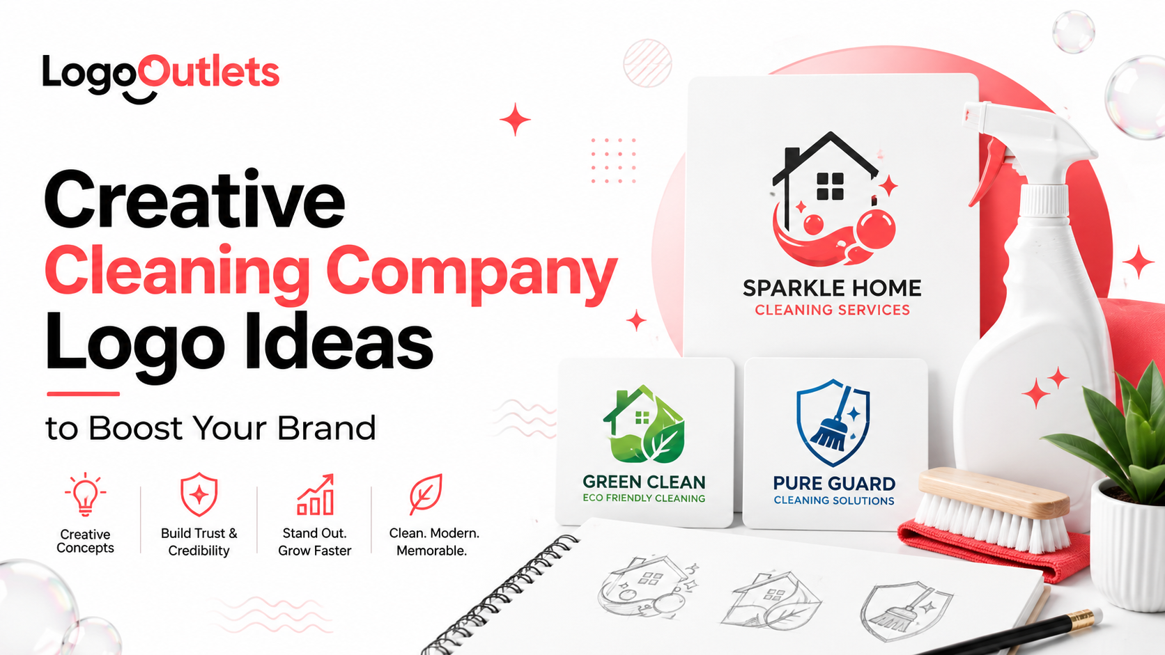
This guide explains how smarter logo design helps cleaning companies reduce hesitation, strengthen trust, and position themselves as reliable professionals rather than interchangeable providers.
Key Takeaways
- A cleaning company logo influences trust before any service details are reviewed.
- Strong logo design focuses on clarity, legibility, and real-world usability.
- Consistent branding helps cleaning businesses appear more established and reliable.
- Simplicity in logo design supports recognition across vehicles, uniforms, and digital listings.
- The right logo functions as a long-term business asset, not a visual trend.
Why Do Cleaning Company Logo Ideas Matter More Than Ever?
For service-based businesses, consistency does not begin with marketing campaigns or sales messaging.
It begins with how the business appears at first glance.
In cleaning services, the logo is often the earliest signal of professionalism and legitimacy.
It is seen before a website is explored or a quote is requested, shaping whether the company feels reliable and capable of handling responsibility in private or commercial spaces.
That initial judgment happens quickly.
Within seconds, the logo influences how a cleaning company is perceived, whether it appears established, organized, and trustworthy or uncertain and informal.
Well-considered cleaning company logo ideas directly impact:
- Immediate trust judgment
- Perceived professionalism
- Comfort granting access to homes or facilities
- Willingness to accept fair pricing and referrals
This matters deeply in service-based business branding, where customers are inviting teams into homes, offices, and facilities that require care, accountability, and consistency.
A poorly designed logo can quietly suggest:
- Inexperience
- Lack of structure
- Weak operational standards
Strong cleaning business branding, by contrast, communicates reliability before the first conversation ever begins. It reassures prospects that clear systems, professional standards, and accountability exist behind the service long before a team arrives on site.
What Makes Cleaning Company Logo Design Different From Other Industries?
A cleaning company logo design operates under stricter psychological expectations than most industries because it sits at the intersection of trust, access, and responsibility.
Unlike creative, lifestyle, or entertainment brands, cleaning businesses are evaluated on perceived safety and reliability before anything else.
The logo must immediately communicate that the company is capable of operating inside private and commercial spaces without risk or uncertainty.
At its core, a cleaning logo is expected to signal:
- Cleanliness and order
- Safety and reliability
- Operational structure
- Professional systems behind the service
These expectations align with first impression psychology, where visual clarity and recognizable symbolism reduce perceived risk and hesitation. When the logo feels unclear or informal, doubt forms quickly.
Because of this, a professional service logo in the cleaning industry must prioritize clarity over creativity. The goal is not artistic expression, but confidence and credibility.
That leads to very specific design requirements:
- Strong legibility at small sizes
- Clear, easily understood symbolism
- Neutral but confident color psychology
- Scalable logo usage across uniforms, vehicles, invoices, and online listings
In high-trust service categories like cleaning, the logo is not a branding accessory. It is a visual assurance that systems, standards, and accountability exist long before a team arrives on site.
Core Logo Styles That Work for Cleaning Businesses
1. Wordmark Logos for Trust-First Brands
Wordmarks focus on typography rather than symbols.
Best for:
- Established commercial services branding
- Corporate-focused janitorial service logo ideas
- B2B cleaning contracts
Benefits:
- Strong brand recognition
- Easy scalability
- Clean reproduction on uniforms and trucks
Typography should prioritize:
- Sans-serif fonts
- Medium weight
- High legibility
2. Symbol-Based Logos for Fast Recognition
Symbols help brands stand out visually.
Common icon themes:
- Shields (security and safety)
- Sparkles (cleanliness)
- Checkmarks (completion and reliability)
- Abstract swooshes (motion and efficiency)
When designed correctly, symbol-based cleaning service logo ideas improve recall and visual consistency.
3. Combination Logos for Growth-Stage Businesses
Combination logos merge text and icon elements.
Best for:
- Scaling cleaning services
- Franchising plans
- Multi-location operations
This structure supports:
- Strong brand identity
- Flexible usage
- Better long-term brand recognition
How Color Psychology Impacts Cleaning Company Logos
Color in cleaning branding is not a matter of personal taste.
It is psychological signaling that influences whether a business feels safe, professional, and reliable.
In a high-trust service like cleaning, color choices shape emotional judgment quickly. Long before a prospect reads a service list or compares pricing, color helps reduce or increase perceived risk.
Certain colors commonly signal trust and cleanliness in service-based industries like cleaning.
High-Trust Color Choices
- Blue signals reliability, stability, and professionalism
- Green communicates sustainability, responsibility, and care
- White reinforces purity, cleanliness, and order
An eco-friendly cleaning business benefits most from green-based palettes supported by clear white space. This combination communicates health, responsibility, and attention to detail without visual noise.
Colors to Use Carefully
- Red can signal urgency or intensity, which may feel misaligned with calm, controlled environments
- Black-dominant palettes can appear harsh or unapproachable unless balanced with lighter neutrals
In practice, consistency matters more than choosing a “perfect” color. Even strong color choices lose credibility when applied inconsistently across uniforms, vehicles, invoices, proposals, and online listings.
When color usage feels controlled and repeatable, brand trust and perceived service quality increase before a single interaction takes place.
Typography Choices That Signal Professionalism
Typography is often underestimated in logo design, yet it plays a decisive role in how professional and legitimate a cleaning business appears.
In high-trust service categories, typography affects whether a brand feels established and reliable or informal and risky.
Because cleaning logos appear on uniforms, vehicles, invoices, proposals, and online listings, typography must perform well in real-world conditions, not just on a screen.
Professional typography should be:
- Simple, with clean letterforms that are easy to recognize at a glance
- Balanced, using consistent spacing and proportion to avoid visual tension
- Scalable, remaining legible on everything from van decals to digital thumbnails
Certain typography choices consistently weaken credibility in cleaning company logo design and should be avoided:
- Script fonts that feel informal or decorative
- Over-stylized letterforms that reduce legibility
- Trend-heavy typefaces that age quickly
- Thin or condensed fonts that disappear at small sizes or from a distance
Strong typography supports professional branding and reinforces industry credibility by making the brand easy to read, easy to recognize, and consistent across every customer touchpoint.
If a logo is difficult to read on a vehicle or uniform, it will feel unprofessional everywhere else as well.
Comparison Table of Logo Styles and Use Cases
| Logo Style | Best For | Key Advantage |
| Wordmark | Corporate cleaning companies | Maximum clarity |
| Symbol-based | Residential services | Fast visual recall |
| Combination | Growth-stage brands | Long-term flexibility |
| Minimalist | Modern startups | Clean perception |
| Eco-themed | Green cleaning brands | Sustainability messaging |
Case Studies: How Real Cleaning Brands Use Logo Design to Build Trust
Real-world cleaning brands offer clear insight into how logo design and visual identity influence trust, credibility, and positioning.
Rather than relying on assumptions or vanity metrics, the following examples examine how established brands use clarity, consistency, and discipline in their logos to support residential, commercial, and eco-friendly cleaning services.
Case Study 1: How Merry Maids Uses Brand Consistency to Earn Residential Trust
Merry Maids operates in residential house cleaning, a category where trust and familiarity are decisive factors.
The brand’s visual identity prioritizes recognition, clarity, and consistency across local markets to reduce hesitation at first glance.
Rather than relying on complex symbolism, the logo system emphasizes legible typography, restrained icon usage, and consistent color application.
This approach supports recognition on service vehicles, uniforms, invoices, and local listings, where residential customers often make quick judgments.
Branding insight:
- Residential cleaning logos benefit from simplicity and familiarity
- Clear typography improves recognition across physical touchpoints
- Consistent application reinforces a trustworthy brand image
This example shows how house cleaning logo ideas work best when they focus on recognition and reliability rather than decorative complexity.
Source: https://www.merrymaids.com/about-us/
Case Study 2: Why ServiceMaster Clean Prioritizes Logo Discipline in Commercial Environments
ServiceMaster Clean operates heavily in commercial and institutional environments, where brand credibility directly influences procurement decisions.
In this context, the logo is not just a visual asset, but a marker of operational discipline.
The brand maintains strict control over how its logo is used across signage, proposals, uniforms, and facility-facing materials.
The identity system emphasizes structured typography, balanced proportions, and restrained symbolism that align with corporate and facility-management expectations.
Branding insight:
- Commercial cleaning logos must signal structure and authority
- Controlled logo usage supports B2B credibility
- Visual discipline aligns with procurement and compliance standards
This case demonstrates why commercial cleaning logo ideas should prioritize consistency, legibility, and authority over creative expression.
Source: https://www.servicemasterclean.com/why-servicemaster-clean/
Case Study 3: How Seventh Generation Balances Sustainability and Professional Credibility Through Logo Design
Seventh Generation provides a clear example of how an eco-friendly cleaning brand can balance sustainability messaging with professional credibility.
The company publicly documented its brand evolution, including updates to its logo and visual identity.
The logo incorporates restrained natural symbolism paired with neutral typography, avoiding exaggerated “green” visuals that could undermine trust.
This disciplined approach allows the brand to communicate environmental responsibility while remaining scalable across packaging, digital platforms, and retail environments.
Branding insight:
- Subtle symbolism helps avoid greenwashing perceptions
- Neutral typography reinforces professionalism
- Consistent application strengthens long-term brand identity
This case illustrates how eco-friendly cleaning business logo ideas can express values clearly without sacrificing trust or commercial relevance.
Source: https://www.seventhgeneration.com/about-us
Why Simplicity Wins in Cleaning Business Logos
Complex logos tend to break down in real-world cleaning applications, where brands are judged quickly and often from a distance.
In a high-trust service like cleaning, simplicity helps reduce hesitation and supports fast credibility judgments.
Cleaning logos must perform across everyday touchpoints, not just on a website. They appear on:
- Service vans and vehicles
- Staff uniforms and embroidery
- Invoices and printed materials
- Digital listings and local profiles
Because of this wide range of uses, simplicity is not a design preference. It is a functional requirement.
A scalable logo ensures:
- Clear readability at both large and small sizes
- Accurate reproduction across print, vinyl, and embroidery
- Fewer production errors and lower reproduction costs
- Consistent recognition over time
When logos rely on intricate details, thin lines, or excessive elements, clarity suffers, and inconsistency creeps in. Over time, that inconsistency weakens trust.
Simplicity strengthens customer trust signals by making the brand feel organized, professional, and dependable.
| As a rule of thumb, if a logo is not immediately readable on a moving van or a uniform, it will struggle everywhere else. |
Common Logo Mistakes Cleaning Businesses Should Avoid
Many cleaning companies struggle with branding, not because they lack effort, but because small design mistakes quietly undermine trust at first glance. In a high-trust service category, these errors compound quickly.
The most common logo mistakes in cleaning company logo design include:
- Overusing clip-art or stock icons, which makes the brand look interchangeable with dozens of local competitors
- Relying on trendy fonts that age quickly and reduce long-term brand credibility
- Poor contrast or legibility, especially on vans, uniforms, and small digital listings
- Skipping real-world usage testing, resulting in logos that break down in embroidery, signage, or thumbnail views
- Generic sparkle, bubble, or house symbols that fail to create a distinctive visual identity
These mistakes weaken brand trust, increase hesitation, and make even strong cleaning services appear less professional.
Over time, they reduce recall, put pressure on pricing, and limit the brand’s ability to stand out in local and commercial markets.
How Cleaning Company Logo Ideas Should Align With Growth Goals
A logo should never be designed only for today’s version of the business. In cleaning, growth often brings new services, new clients, and new operational demands, and the logo must be able to scale with that direction.
Well-planned cleaning company logo ideas anticipate expansion instead of forcing redesigns later. Before committing to a logo, business owners should ask:
- Will this logo still work if the company adds new services such as commercial contracts, specialty cleaning, or multiple crews?
- Does it feel equally credible for residential customers and commercial decision-makers?
- Can it remain clear and recognizable across key touchpoints such as vans, uniforms, invoices, proposals, and Google Business Profile listings?
- Will it adapt cleanly to digital environments like social profile icons, website headers, and booking platforms without losing legibility?
- Can the logo support future brand structure, such as separate service categories or multiple locations, without redesigning the core identity?
Strong logo concepts align with long-term business strategy, not short-term design trends. When logos fail to account for growth, cleaning businesses often face costly reprints, vehicle repainting, inconsistent listings, and the need for premature rebranding.
Designing with growth in mind protects brand consistency and supports expansion instead of slowing it down, which is why many cleaning businesses eventually turn to custom logo design services to avoid costly redesigns later.
What Role Does Brand Consistency Play After Logo Design?
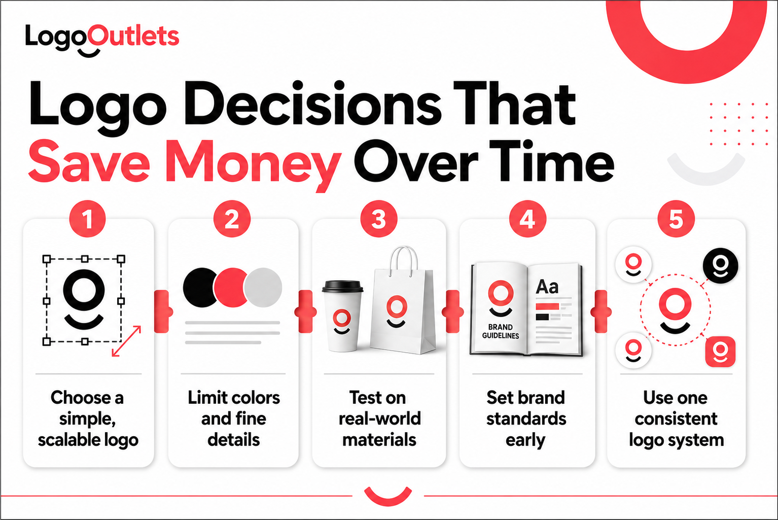
A logo is only the starting point of a cleaning brand’s identity. What builds real trust over time is how consistently that logo and visual system appear across every customer touchpoint.
In cleaning services, customers encounter the brand repeatedly before and after hiring. Consistency across these touchpoints reduces hesitation and reinforces professionalism:
- Website and service pages
- Social media profiles and profile icons
- Service vehicles and fleet signage
- Staff uniforms and embroidered apparel
- Invoices, proposals, and printed materials
- Google Business Profile listings and local directories
When these elements look aligned, the brand feels organized, dependable, and legitimate. When they don’t, even a well-designed logo can feel unreliable or unprofessional.
Inconsistent branding creates mixed signals. Colors shift. Fonts change. Logos appear slightly different in each place. Over time, this weakens recognition, erodes trust, and makes the business feel less established than it actually is.
Strong brand consistency reinforces visual identity, improves recall, and strengthens trust signals every time a customer sees the brand. For cleaning businesses that rely on repeat exposure and referrals, consistency is not optional. It is what turns a logo into a credible brand.
Final Thoughts
Effective cleaning company logo ideas are not created to look appealing in isolation. They are built to function inside a trust-sensitive industry where perception directly influences decisions.
For cleaning businesses, a logo is one of the few assets that works continuously without explanation. It shapes credibility before a quote is requested, reinforces professionalism during service delivery, and supports recognition long after the job is complete.
The strongest logos in this space share one common trait: they feel intentional.
They communicate order, reliability, and structure without needing justification. Over time, that consistency compounds into familiarity, and familiarity becomes trust.
This is why branding in cleaning is never cosmetic. It is operational.
When logo decisions are made with clarity, scalability, and real-world use in mind, the brand gains an advantage that competitors struggle to replicate.
In a market where many services look interchangeable, the logo quietly decides who feels established and who feels uncertain, often before a single conversation takes place.
Not sure if your logo is helping or holding your cleaning brand back?
The team at Logo Outlets can assess alignment, scalability, and real-world usability. Reach out at info@logooutlets.com or 201-820-6598 to start the conversation.
FAQs
1. Why do businesses choose Logo Outlets for custom cleaning company logo design?
Logo Outlets specializes in professional logo design for cleaning businesses, with a strategy-first process focused on trust, clarity, and real-world usability. Each custom cleaning company logo is built to perform across vehicles, uniforms, digital listings, and long-term brand growth, not just look good in isolation.
2. What are the best cleaning company logo ideas?
The best cleaning company logo ideas prioritize clarity and trust. Clean typography, restrained symbolism, and reliable color choices help brands look professional on vans, uniforms, and local search thumbnails where decisions are made quickly.
3. How do you design a cleaning company logo that looks professional?
Design starts with real-world usage. A professional cleaning company logo remains legible on vehicles, uniforms, invoices, and digital platforms, using balanced typography and controlled color psychology to reduce hesitation.
4. What makes a good cleaning company logo?
A good cleaning company logo is recognizable, consistent, and appropriate for a high-trust service. It should feel credible to homeowners and commercial decision-makers while remaining scalable as services or locations expand.
5. Are there professional cleaning logo ideas for small businesses?
Yes. Professional cleaning logo ideas for small businesses often use clean wordmarks, minimal icons, and strong contrast. These choices help smaller teams appear established and dependable without relying on complex visuals.
6. Where can I find modern cleaning logo design examples?
Modern cleaning logo design examples typically feature minimal layouts, neutral typography, and disciplined color palettes. These styles prioritize clarity and consistency across digital platforms and physical branding.
7. Should I choose a custom cleaning company logo or a template?
In most cases, a custom cleaning company logo is the better long-term choice. Custom logos avoid generic symbols, improve consistency, and adapt more easily as services, locations, or client types grow.
8. What’s the difference between a custom cleaning company logo and a custom cleaning company logo design?
A custom cleaning company logo is the final visual mark. Custom cleaning company logo design includes the strategy behind it, typography, color systems, scalability, and usage guidelines, so the logo works consistently everywhere.
9. When should I hire a logo designer for a cleaning company?
You should hire a logo designer for a cleaning company when branding needs to support credibility, growth, or repositioning. Experienced designers understand cleaning-industry trust signals and operational touchpoints like vehicles, uniforms, and proposals.
10. Is professional logo design worth it for a cleaning business?
Yes. Professional logo design for cleaning businesses typically reduces hesitation, improves recognition, and strengthens trust, often influencing decisions before any conversation takes place.