Every builder knows the frustration of delivering solid work and still being underestimated at first glance.
Projects are completed professionally. Standards are maintained. Quality is not the issue.
The problem appears earlier.
It shows up the moment a potential client glances at a truck, a job-site sign, or a proposal header and subconsciously decides whether the business looks reliable.
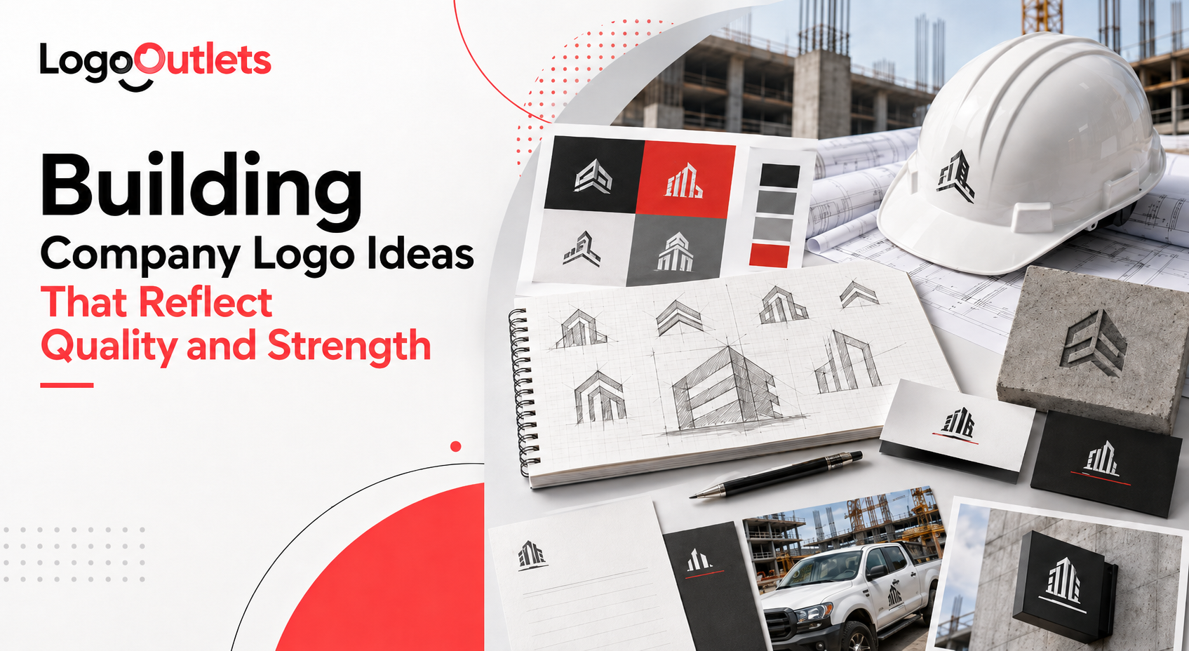
This is why building company logo ideas matters far more than most construction firms realize. Logos in construction are not decorative assets.
They function as credibility signals that shape perception before a conversation, a walkthrough, or a bid review ever takes place.
Research summarized in Color Psychology shows that people form rapid impressions of brands and that color plays a significant role in shaping perception and emotional response.
Leonardo da Vinci captured this principle succinctly when he said,
“Simplicity is the ultimate sophistication.”
In construction branding, simplicity translates into clarity, legibility, and control. These are the exact traits clients subconsciously look for when judging logos on trucks, job sites, proposals, and bid documents.
This article outlines what strong construction logos communicate at a glance and why those signals directly affect perception, shortlisting, and confidence.
Key Takeaways
- Construction logos are judged in seconds, often without context or explanation.
- Strong logos signal reliability, structure, and professionalism at first glance.
- Typography and color choices influence trust more than visual complexity.
- Consistency across trucks, signage, and proposals strengthens brand recognition.
- Effective building company logo ideas support long-term credibility, not trends.
Why Do Building Company Logos Matter More Than Most Owners Realize?
Construction is a high-risk and high-investment business.
Clients are not making casual purchases.
They are choosing a company they will trust with property, safety, timelines, and significant capital.
Because construction quality cannot be evaluated instantly, early decisions are shaped by perception rather than proof.
Before workmanship, references, or results can be reviewed, decision-makers look for cues that suggest professionalism, structure, and reliability.
This is where branding carries more weight in construction than in many consumer industries.
Professional building company logos consistently outperform informal or DIY visuals because they reduce perceived risk at the exact moment buyers are deciding who deserves further consideration.
That advantage shows up in practical ways:
- Being shortlisted over similar competitors
- Creating confidence during bid and proposal reviews
- Establishing credibility before site visits or conversations
In construction, a logo is not a marketing detail.
It acts as an early credibility filter that determines whether a company is taken seriously at all.
What Makes Building Company Logo Ideas Communicate Strength?
Strength in construction branding does not come from aggressive imagery or oversized symbols.
It comes from clarity, structure, and visual restraint.
When clients evaluate builders, they are not looking for creativity. They are looking for signals that suggest discipline, stability, and operational control. That evaluation happens quickly, often without conscious analysis.
This is why effective building company logo ideas follow a different logic than logos created for creative or lifestyle brands. The goal is not self-expression. The goal is confidence at first glance.
Core Attributes of Strong Construction Logos
- Clear typography that remains legible on trucks, signage, and safety gear
- Balanced layouts that feel structured and intentional rather than decorative
- Limited color palettes that communicate professionalism and consistency
- Symbols rooted in geometry, grids, or structural forms that imply precision and permanence
- Consistent application across physical assets, proposals, and digital platforms
This is where construction branding diverges sharply from trend-driven design. In construction, visual strength is measured by how quickly a logo communicates reliability, not how creatively it stands out.
What Role Does Typography Play in Construction Logo Design?
Typography is one of the most underestimated elements in contractor logo design, yet in many construction contexts it carries as much credibility weight as symbols, and sometimes more.
When clients evaluate a construction company, design is rarely analyzed consciously. Judgment happens through ease of processing and perceived professionalism at a glance.
Research on the psychology of fonts shows that audiences assess credibility and competence partly through typography. Poor font choices can weaken trust, while thoughtful typography reinforces professionalism and reliability, as explained in The Psychology of Fonts and Logos.
That effect is driven largely by legibility.
Fonts with clear letterforms, adequate spacing, and balanced proportions reduce cognitive effort.
Viewers absorb information quickly instead of struggling to decode it.
In construction, where logos are often judged during quick proposal skims, truck-door glances, or job-site signage views, that clarity quietly signals control and discipline.
For this reason, effective logo typography for builders consistently follows a few practical principles:
- Sans-serif or industrial-inspired fonts that prioritize clarity
- Strong vertical alignment that reflects structure and order
- Moderate font weight that feels solid without appearing aggressive
- High legibility at small sizes across trucks, signage, and safety gear
Typography anchors perception at a subconscious level.
It helps decision-makers determine whether a construction business appears dependable and professional, or informal and experimental, before any work is reviewed.
How Does Color Psychology Influence Brand Trust in Construction?
Color choice in construction branding functions as behavioral signaling, not decoration.
Before a builder’s experience, process, or workmanship can be evaluated, color sends immediate credibility cues.
Those cues shape whether a company appears reliable or uncertain at first glance, often during moments like a logo on a passing truck, a job-site sign scan, or a proposal header skim.
In professional services branding, especially within construction, color carries added weight because clients are making high-risk decisions. Creativity becomes secondary. Buyers scan for visual markers that suggest control, stability, and professionalism.
This is why effective construction branding relies on color choices that reduce perceived risk rather than compete for attention.
Common Color Associations in Construction Logos
- Blue: Signals reliability, responsibility, and professionalism
- Dark gray: Conveys strength, structure, and seriousness
- Black: Communicates authority, stability, and control
- Muted earth tones: Suggest durability and grounded operations when used with restraint
These color choices are not trends.
They operate as credibility signals that support brand trust and business credibility in an industry where confidence strongly influences who gets considered.
What Types of Building Company Logo Ideas Work Best?
Not all construction businesses operate the same way, and effective branding reflects that reality.
A residential contractor, a commercial builder, and a property developer face different buying environments, risk profiles, and evaluation moments.
As a result, the building company logo ideas that work best are those aligned with how and where the brand is judged in the real world.
The goal is not to pick a “popular” logo style but to pick a structure that reinforces credibility in the contexts that matter most.
Logo Styles That Perform Well in Construction
- Wordmarks: Best suited for firms emphasizing longevity, reputation, and name recognition. Wordmarks perform well on proposals, legal documents, signage, and commercial bids where clarity and authority matter more than symbolism.
- Icon-based logos (icon + name): Ideal for scalability across vehicles, uniforms, equipment, and digital platforms. These work especially well for growing contractors with fleets, multiple crews, or multi-location operations where fast recognition is critical.
- Monograms: Most effective for established or premium firms with frequent brand exposure. Monograms simplify long company names and perform best when used consistently across trucks, site boards, and commercial projects.
- Abstract structural symbols: Geometry-driven marks inspired by grids, frameworks, or architectural forms. These suit modern builders and developers, positioning around precision, systems, and contemporary execution rather than tradition.
Each of these approaches serves a different business objective within a broader brand identity and visual identity system.
When chosen correctly, the logo style reinforces how the company wants to be perceived before qualifications, pricing, or experience are even discussed.
Comparison of Logo Style and Real-World Use
| Logo Style | Best Use Case | Strength Signal | Scalability |
| Wordmark | Established firms | Professional authority | High |
| Icon + Text | Growing contractors | Balanced credibility | Very high |
| Monogram | Premium developers | Legacy and strength | Medium |
| Abstract Symbol | Modern builders | Structural precision | High |
This comparison shows why scalable logo design is not optional in construction. Logos must perform across trucks, helmets, signage, websites, and proposals without losing clarity.
How a Logo Is Judged When No One Is Explaining It
Consider a mid-sized commercial contractor preparing to move into larger and higher-value projects.
On paper, the company is qualified.
Years of experience. Solid portfolio. Competitive pricing.
The Challenge
Despite strong operations, the contractor struggles to get shortlisted consistently.
Feedback is vague:
- “We went in another direction.”
- “The project scope changed.”
- “The client preferred a different vendor.”
No direct criticism. No clear rejection reason.
In reality, the issue appears earlier than most builders expect.
The Evaluation Moment
Before any call or meeting, decision-makers encounter the brand in quick, fragmented ways:
- A logo on a truck passing a job site
- A proposal header skimmed alongside competitors
- A brief website check to confirm legitimacy
In these moments, the logo communicates more than intended.
The existing mark:
- Uses thin typography that feels lightweight
- Relies on detailed graphics that don’t scale well
- Looks informal next to more restrained competitors
Nothing is “wrong,” but nothing signals authority either.
The Branding Decision
The contractor invests in a logo system designed for real-world use, not visual flair.
The focus shifts to:
- Clear, structured typography
- Simplified forms that scale across trucks and signage
- A restrained color palette that feels professional
No rebrand story. No explanation. Just consistency.
The Outcome
Over time, the perception changes.
- Proposals feel more credible at first glance
- The brand blends naturally into commercial environments
- Shortlisting becomes more consistent
Nothing else about the business changes. The work is the same. The pricing is the same.
What changes is how early trust is established.
This is how branding works in construction. It rarely wins projects on its own, but it often decides who gets taken seriously enough to compete.
Why Professional Building Company Logos Avoid Trends
Trends age quickly, but buildings do not.
Construction companies operate on timelines measured in decades, not seasons. A logo that feels fashionable today can look dated within a few years, creating unnecessary inconsistency across trucks, signage, uniforms, proposals, and digital assets.
For construction firms, trend-driven logos introduce real business risk. Visual updates are not abstract design decisions. They carry costs, disrupt recognition, and weaken long-term credibility when branding changes too frequently.
This is why professional building company logos prioritize longevity, clarity, and function over novelty.
Timeless construction logos are designed to:
- Remain legible and credible across years of use
- Perform in one color as well as full color
- Scale cleanly across physical and digital applications
- Maintain consistency as the business grows or expands
When branding avoids trends, it supports stable recognition and reinforces trust during bid comparisons, vendor shortlisting, and long-term client relationships.
| Things to Consider:
In construction, consistency signals reliability, and reliability determines who gets taken seriously. |
What Do Construction Clients Look for at First Glance?
Construction clients rarely analyze logos in a deliberate or technical way.
Their judgment forms instinctively and quickly.
At first glance, decision-makers are not asking whether a logo is creative.
They are assessing whether the company behind it appears dependable enough to consider.
In construction, a few core signals shape instinctive evaluation:
- Stability: Clean layouts, balanced proportions, and restrained visuals that suggest control
- Order: Clear structure and legibility that imply organized operations
- Professional discipline: Consistent design choices that feel intentional rather than improvised
- Long-term viability: A logo that looks established and built to last, not experimental or temporary
When these signals are missing, uncertainty is introduced. Excessive detail, visual clutter, or overly clever design choices slow interpretation and quietly raise questions about reliability.
This is why construction company logo ideas must prioritize clarity and restraint. In a high-risk industry, first impressions do not need to impress. They need to reassure.
Who Should Invest in Professional Logo Design for Builders?
Not every construction company needs an immediate logo redesign.
But certain business stages make branding a strategic requirement rather than a cosmetic choice.
A professional logo strategy, built to perform across fleets, signage, proposals, and digital listings, becomes especially important for businesses relying on professional custom logo design services to align brand perception with real-world expectations, including:
- Builders entering commercial or government bidding
- Credibility is assessed before experience can be reviewed.
- Contractors scaling into multi-location or multi-crew operations
- Consistent recognition across trucks, sites, and teams becomes critical.
- Developers repositioning toward higher-value or higher-margin projects
- Perceived professionalism directly influences pricing confidence.
- Firms dealing with inconsistent visuals across assets
- Fragmented branding creates doubt during evaluation.
In these situations, professional logo design for builders functions as strategic risk management.
It reduces misinterpretation, supports confidence during shortlisting and bid reviews, and ensures the brand does not become a liability at critical decision points.
How Does Brand Consistency Support Long-Term Recognition?
Consistency is one of the strongest drivers of trust in professional services, especially in construction.
Clients rarely encounter a brand in one place. They see it on proposal headers, job-site signage, vehicles, digital listings, and referral materials. When those touchpoints feel aligned, recognition builds naturally. When they do not, confidence erodes.
Research published by Lucidpress in its State of Brand Consistency Report found that companies with consistent brand presentation can see up to a 33% increase in revenue, according to this PRNewswire release on brand consistency and revenue growth.
While the study evaluates branding at an organizational level, the insight applies directly to construction, where repeated exposure plays a critical role in vendor comparison and bid evaluation.
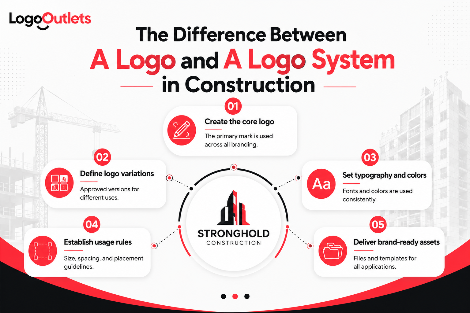
A logo functions as the anchor of a broader brand identity system. Without consistency in how that logo is applied, even a well-designed mark loses its ability to build recognition or credibility over time.
Consistent branding supports:
- Faster brand recognition across repeated touchpoints
- Reduced confusion when clients compare multiple contractors
- Stronger recall during shortlisting and decision-making
- More professional market perception in commercial and competitive environments
This is why building a company logo design must be planned as part of a system, not treated as a standalone asset.
| Things to Consider:
In construction, consistency compounds trust over time, and trust determines which companies remain credible, recognizable, and considered. |
How Do Custom Logo Design Services Support Business Growth?
Generic logos fail because they are disconnected from how construction businesses actually operate.
Building company logo design services and construction logo design services that focus on strategy helps companies align their visual identity with real-world evaluation environments.
This means designing logos that perform in commercial bidding, fleet branding, job-site signage, safety gear, proposals, and digital listings, not just on a website.
Custom logo work supports growth by ensuring:
- Industry-aligned symbolism: Visual elements that feel credible within construction, avoiding clichés or decorative shortcuts
- Scalable formats: Logos that work across trucks, equipment, signage, proposals, and one-color applications
- Clear ownership and usage rights: Preventing legal issues and confusion as the business expands
- Long-term adaptability: A visual foundation that can support new services, locations, or market positioning
For firms planning expansion, custom logo design for construction companies reduces redesign cycles, minimizes friction during growth, and supports confidence when entering larger bids or higher-value markets.
Conclusion
Strong construction brands are not built on visuals alone, but visuals play a decisive role in how trust is formed.
Well-executed building company logo ideas communicate strength without explanation. They establish professionalism at first glance and reinforce credibility during evaluation, long before experience or pricing is reviewed.
For builders, contractors, and developers, a logo is not decoration but a credibility signal that shapes perception in moments that matter.
When aligned with strategic intent, a construction logo becomes one of the most valuable business assets a company can own. It influences shortlisting, supports confidence during bid decisions, and helps ensure the business is taken seriously as it grows.
If you’re unsure whether your current logo supports that level of trust, it may be time to reassess how your brand is being judged. Logo Outlets works with construction businesses to clarify first impressions and strengthen credibility without guesswork.
Reach out at info@logooutlets.com or call 201-820-6598 to start the conversation.
FAQs
How does Logo Outlets approach logo design for construction companies?
Logo Outlets designs logos around real construction use, not visual trends. Every logo is built for clarity, scalability, and credibility across trucks, job-site signage, proposals, and bid documents.
Does Logo Outlets offer full construction company branding services or just logos?
Logo Outlets provides full construction company branding services, including logo systems, visual usage guidelines, and brand assets designed for consistent, long-term professional use.
What makes a good building company logo?
A good building company logo is simple, legible, and consistent. It communicates stability and professionalism while performing clearly across physical and digital environments.
How do you design a construction company logo correctly?
To design a construction company logo correctly, the focus should be on strong typography, controlled color use, and a scalable structure that signals reliability rather than creativity.
Why do logos matter for construction companies?
Logos matter for construction companies because they influence first impressions during shortlisting, bid reviews, and vendor comparisons before any conversation takes place.
What are the best building company logo ideas for long-term credibility?
The best building company logo ideas use clear wordmarks, structured icon systems, or restrained monograms that scale well and feel established in commercial settings.
What defines modern construction logo ideas without hurting trust?
Modern construction logo ideas focus on clean typography, balanced layouts, and minimal symbolism while avoiding design trends that quickly date the brand.
Where can businesses find professional construction logo examples?
Professional construction logo examples are typically found in commercial contractor portfolios, fleet branding, job-site signage, and bid-ready brand systems rather than consumer-style design galleries.
When should a business hire a logo designer for a construction company?
A business should hire a logo designer for a construction company when entering commercial bidding, scaling operations, repositioning upmarket, or addressing inconsistent branding.