The crew may be solid. The work may be clean. The owner may have spent years building a reputation one project at a time.
Then the proposal lands on a client’s desk, and the logo does something unfair.
It makes the company look smaller than it is.
That is the uncomfortable part of a weak logo. It does not tell the full truth about the contractor behind it. A professional construction logo should make an established crew look reliable, prepared, and serious. A poor one can make the same crew feel like a weekend side hustle, especially beside a competitor with sharper construction company branding.
For construction owners who have recently lost a bid, felt embarrassed sending a proposal, or started wondering whether the old logo is holding the company back, this is a useful moment. Not a shameful moment. A reset moment.
Key Takeaways
- A weak logo can make a skilled crew look less established.
- The biggest mistakes usually involve trends, fonts, clutter, poor testing, and wrong audience fit.
- A logo should work on proposals, trucks, uniforms, signs, and digital profiles.
- Rebranding can be a smart move when the current identity no longer matches the company.
Why Does Strong Work Need Strong Branding?
A construction company can outgrow its logo quietly.
At first, the old mark may have been enough. Maybe it was made quickly by a cousin, pulled from a template, or built during the first year when the business only needed a truck magnet and a Facebook page.
Then the company grew.
The crew got better. The projects got bigger. The estimates became more detailed. The owner started meeting clients who compare multiple firms, study proposals carefully, and notice the difference between a company that looks established and one that looks patched together.
A weak logo creates a gap between the work and the way the work is presented.
That gap is where doubt enters.
A professional construction logo does not need to look fancy. It needs to look intentional. It should make the company name clear, support the right impression, and work across the places clients actually see the business.
This is where a clear construction company brand strategy matters, because the logo should match the company’s current level of work, target clients, and future direction.
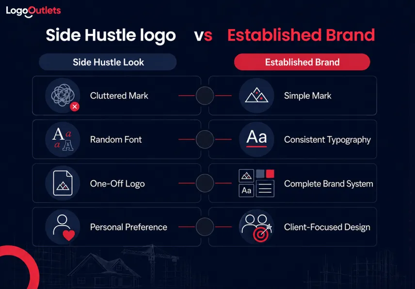
A side-hustle-looking logo often does the opposite. It feels temporary, mismatched, over-decorated, or too generic to remember.
Five Logo Mistakes That Make Crews Look Less Established
Mistake 1: Trends Can Weaken Your Brand
Trendy logos can feel exciting in the moment.
A gradient effect. A 3D shine. A dramatic shadow. A futuristic font. A flashy icon that looks modern for one season and tired the next.
For a construction company, this is risky. The logo is not only living on a website. It may end up on trucks, yard signs, shirts, invoices, safety gear, proposal folders, and site boards. Changing all of that because a trend aged badly is not a small inconvenience.
It can become a rebrand bill.
A timeless construction logo design usually leans on strong basics: clear type, balanced spacing, simple shapes, practical colors, and good contrast. It does not chase every visual fad because construction buyers are not looking for a trendy crew. They are looking for a dependable one.
That does not mean the logo must look old-fashioned. A modern construction logo can still be timeless. The difference is restraint.
The question is not, “Does this feel popular right now?”
The better question is, “Will this still look serious on a truck five years from now?”
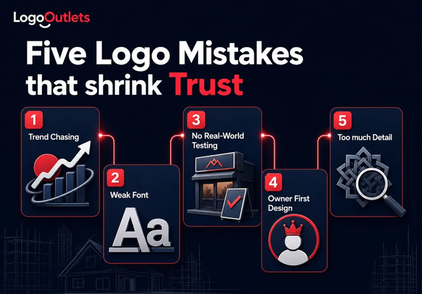
Mistake 2: Weak Fonts Hurt First Impressions
Typography carries tone before the client reads the words.
A font can make a contractor feel strong, precise, rugged, premium, approachable, or careless. It can also make a serious crew look like a temporary operation.
This is where many construction logos go wrong. The company name is written in a font that is too thin, too decorative, too playful, too compressed, or too hard to read from a distance. Sometimes the problem is not one bad font but too many fonts competing in one small space.
A construction logo should not make the client work to understand the company name.
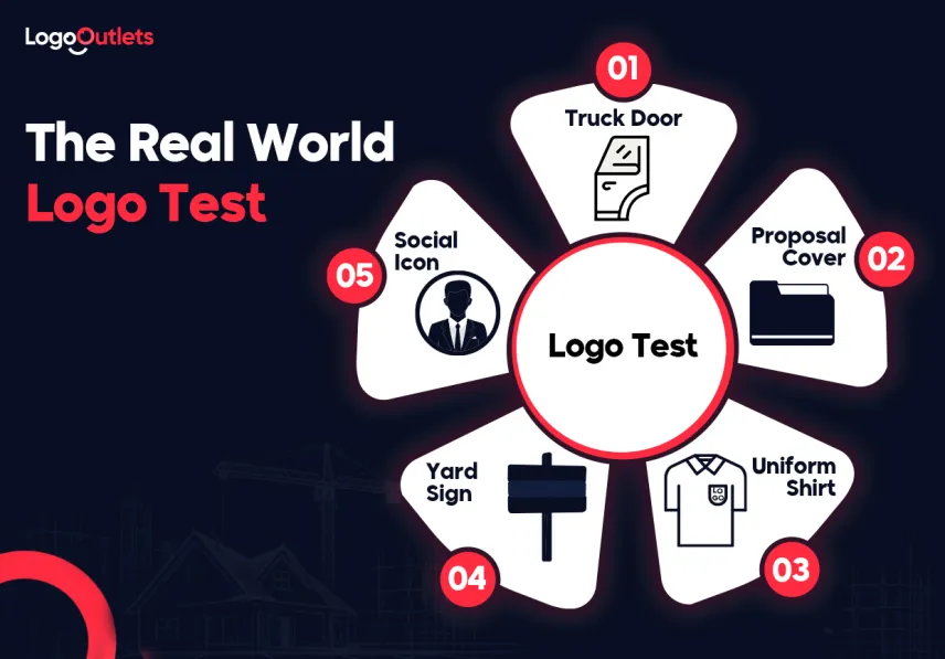
Fonts should be readable on:
- A truck door from across the street
- A proposal cover at arm’s length
- A yard sign from a passing car
- A uniform shirt in a jobsite photo
- A small social media profile image
Most established contractors do not need loud typography. They need controlled typography.
A premium construction logo often starts with a strong, readable type because premium does not mean complicated. It means clear, confident, and built for trust.
A strong font choice says, “This company knows who it is.” A weak one says, “This was assembled quickly.”
Mistake 3: Unchecked Logos Create Problems
A logo can look beautiful in a clean mockup and fail in daily use.
This is one of the most expensive mistakes because it usually appears after production. The business has already ordered shirts. The truck vinyl is already installed. The yard signs are already printed. Then someone notices the logo loses detail, the name is too small, or the colors do not work on dark backgrounds.
A professional logo should be tested before it goes live.
The basic test is simple:
- Put it in black and white.
- Shrink it to business card size.
- Place it on a truck mockup.
- Place it on both light and dark backgrounds.
- Check it as a social media icon.
- Imagine it stitched on a shirt.
If the logo struggles in these conditions, the design is not ready.
Construction company branding has to survive more than a screen. It has to work through dirt, sunlight, printing differences, distance, and movement. A logo that only works in one perfect setting becomes a liability.
Saul Bass said, “Logos are a graphic extension of the internal realities of a company.“ For a contractor, that ambassador is on the truck before the owner arrives at the estimate.
Mistake 4: Designing for Yourself Hurts Trust
Many owners choose logos based on personal taste.
That is understandable. It is their company. Their name may be on the truck. Their years of work are behind the brand.
But the logo is not only for the owner.
It is for the client who has to decide whether this company feels right for the project.
A contractor may love a certain color, symbol, or font. But if that choice makes the company look too casual, too cheap, too aggressive, or too small for the target market, it is not helping.
A remodeling company trying to win high-end home projects should not look like a bargain repair service. A commercial contractor should not look like a hobby handyman. A specialty trade should not look like a generic builder.
A good logo reflects the audience’s expectations while still feeling true to the company.
That balance matters.
The owner should ask:
- What type of client is this logo speaking to?
- Does it match the kind of jobs the company wants more of?
- Would it look comfortable beside more established firms?
- Does it make the company feel trustworthy at first glance?
This is where a rebrand construction company decision often starts. The old logo may still mean something emotionally, but it may no longer speak to the right buyer.
Mistake 5: Too Much Detail Weakens Logos
Construction logos often suffer from too much effort.
A roofline. A hammer. A crane. A wrench. A house. A skyline. A slogan. A badge shape. Three colors. Two fonts. A shadow. A gradient.
All in one logo.
The intention is good. The owner wants the logo to explain everything. The result usually does the opposite. It becomes harder to read, harder to remember, and harder to use.
A logo is not a company brochure. It does not need to show every service.
It needs to be clear enough to recognize and strong enough to carry the brand.
Simple logos often feel more confident because they do not beg for attention. They hold their shape. They scale better. They print cleaner. They are easier to remember.
That does not mean plain. It means edited.
A professional construction logo should be reduced to the strongest idea. One clear mark. One readable name. One controlled style. Enough personality to feel distinct, but not so much detail that it collapses in real use.
That is why reviewing construction company logo ideas should not mean choosing the busiest concept. It should mean finding the clearest idea that can survive real business use.
How Do Weak Logos Make Crews Look Small?
| Logo Mistake | What Clients May Feel | Where It Shows Up | Better Direction |
| Trendy effects | The brand may age quickly | Website, ads, proposals | Use timeless basics |
| Weak fonts | The company feels less serious | Trucks, signs, cards | Choose readable type |
| No testing | The logo feels inconsistent | Shirts, signs, social | Test before launch |
| Owner-first style | The brand misses the target client | Sales calls, proposals | Design for the buyer |
| Too much detail | The logo looks cluttered | Small print, uniforms | Simplify the idea |
This table is not about judging the work behind the logo. It is about reading the signals the logo sends before the owner has a chance to explain.
Do This, Not That: Refresh Without Losing Recognition
A construction company rebrand should improve the identity without erasing everything customers already recognize.
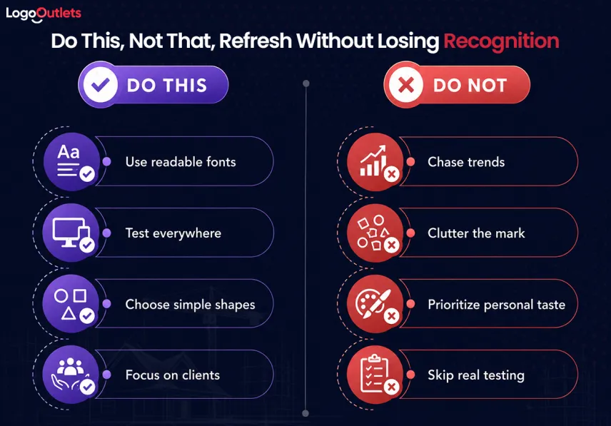
Do this:
- Keep familiar colors, shapes, or symbols that still support the business.
- Simplify clutter and improve readability.
- Create versions for trucks, proposals, uniforms, signs, and digital platforms.
- Request proper vector and print-ready files.
- Use logo design packages that include clear usage guidance.
- Make sure the refreshed identity supports professional builder branding.
Do not:
- Replace every recognizable element without a clear reason.
- follow trends that may quickly look outdated.
- Approve only one logo layout for every application.
- Treat a construction logo builder concept as a complete brand system.
- Launch the new identity without testing it in real business settings.
What Makes Stronger Firms Look More Established?
Stronger firms do not always have louder logos.
Often, they have calmer ones.
The name is readable. The spacing feels controlled. The symbol is not trying too hard. The colors work on trucks and documents. The logo has enough flexibility for a website header, proposal cover, hard hat sticker, and yard sign.
That consistency makes the company feel more established.
This is the value of professional builder branding. It helps the company look organized without making it feel cold, oversized, or disconnected from its local reputation.
A contractor does not need to look like a national corporation. In fact, many clients prefer a local company with a personal feel. But local should not mean improvised. Small should not mean sloppy. Family-owned should not mean outdated.
NAHB’s 2024 builder member census found that the median builder member had only six employees but $3.7 million in gross revenue, which shows why a construction brand can feel local and personal while still needing to look organized, consistent, and ready.
A better brand can still feel honest and grounded.
It just looks ready.
Why Do Contractors Start Thinking About Rebrands?
Consider a familiar situation.
An established contractor loses a bid to a firm with similar experience and similar pricing. Nothing about the loss is obvious. The proposal was fair. The work history was solid. The team could have handled the job.
But the competitor looked more polished.
The losing contractor starts looking at the proposal again. The photos are good. The numbers make sense. The references are strong. Then the logo stands out for the wrong reason. It looks dated. The colors feel dull. The icon is too busy. The proposal cover feels like it belongs to a smaller operation than the company actually is.
That is often how rebrand conversations begin.
Not with vanity.
With a moment of honesty.
The owner realizes the business has grown, but the identity has not grown with it. At that point, the construction business logo cost should be viewed against what the current logo may already be costing in lost confidence, weaker proposals, and inconsistent brand presentation.
Final Thought: Strong Work Deserves a Strong Logo
A weak logo does not make a crew less skilled.
But it can make the company look less ready.
That is why a professional construction logo matters. It helps the outside of the business catch up with the work happening inside it. It makes proposals feel cleaner, trucks look more serious, uniforms feel more coordinated, and the company easier to recognize.
For established contractors, the real question is not, “Is the old logo terrible?”
The better question is, “Does this logo still represent the company we are now?”
If the answer is no, it may be time to clean it up, simplify it, or rebuild it with better strategy. Logo Outlets can help construction companies create a sharper identity for proposals, trucks, signage, and long-term brand use. Contact 201-820-6598 or info@logooutlets.com to get started.
FAQ
What makes a professional construction logo?
A professional construction logo is readable, simple, memorable, and practical across trucks, proposals, uniforms, signs, and digital profiles.
What are common construction logo design mistakes?
Common construction logo design mistakes include trendy effects, poor font choices, too much detail, weak contrast, and not testing the logo in real use.
When should a contractor rebrand?
A contractor should consider a rebrand when the current logo feels outdated, looks weak beside competitors, or no longer matches the company’s level of work.
Can a bad logo make a crew look like a side hustle?
Yes. A bad logo can make a capable crew look less established, especially when it appears on proposals, trucks, uniforms, or yard signs.
How does construction company branding affect trust?
Construction company branding affects trust by making the business feel consistent, organized, and recognizable across every client touchpoint.
Are logo design packages worth it?
Logo design packages can be worth it when they include usable files, logo variations, color guidance, and versions for print, trucks, signs, and digital use.
Should a construction logo include tools?
A construction logo can include tools, but they should be simple and distinctive. Too many tools can make the design look cluttered or generic.
How do you fix an outdated construction logo?
Fix an outdated construction logo by keeping recognizable elements, simplifying clutter, improving type, testing real-world use, and building proper brand files.
Can a logo service help improve an existing logo?
Yes. A logo service can refine an existing logo, improve readability, prepare proper files, and make the brand easier to use across business materials.
Can a logo service help with a full rebrand?
Yes. A logo service can help turn an old mark into a cleaner brand system for proposals, trucks, signage, uniforms, and digital platforms.