A project manager opens three contractor proposals on a Monday morning.
The first one looks clean. The logo is sharp. The company name is easy to read. The proposal cover feels organized, the colors match the website, and the truck photo inside looks like it belongs to the same business.
The second proposal has a fair price and a capable team behind it. But the logo is blurry. The business card looks old. The company profile feels patched together. The truck lettering is hard to read. Nothing looks terrible enough to reject immediately, but something feels uncertain.
That uncertainty is where bigger contracts can quietly slip away.
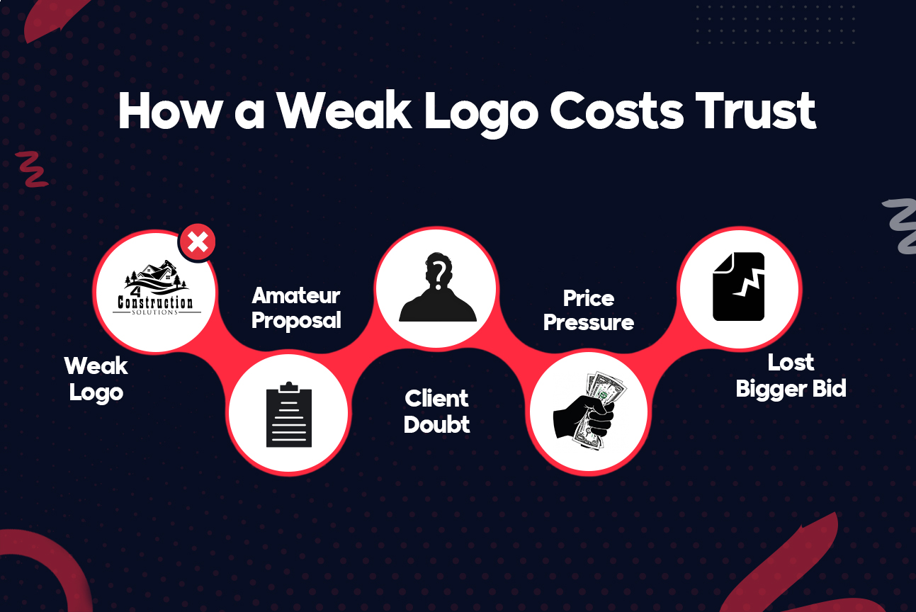
A weak construction company branding does not usually cost a contractor the job in one obvious moment. No client says, “The logo is bad, so the bid is rejected.” The loss is subtler. The brand looks smaller than the company’s skills. The proposal feels less polished than the competitor’s. The business seems less prepared for larger responsibility.
For construction companies trying to win higher-value residential or commercial work, this matters. Bigger clients are not only buying labor. They are buying confidence, communication, reliability, and the belief that the contractor can handle pressure when the job becomes complicated.
Key Takeaways
- A weak logo creates doubt before the price is reviewed.
- Bigger contracts require stronger trust signals.
- A logo must work on trucks, proposals, uniforms, and websites.
- Better branding helps contractors look ready for larger work.
The Hidden Trust Problem in Weak Logos
The real issue is not that a construction logo looks “ugly.”
The issue is that it creates doubt.
A weak construction logo can make a skilled contractor look inexperienced, outdated, or less organized than they really are. That matters because construction clients are naturally risk-conscious. A homeowner worries about delays, budget overruns, damage, and poor communication. A commercial buyer worries about coordination, documentation, safety, timelines, and accountability.
Before either one trusts a contractor with a bigger project, they look for signs.
Some signs are direct: portfolio, reviews, licenses, referrals, insurance, and past work.
Other signs are indirect: logo, proposal design, website quality, email signature, truck branding, uniforms, and the way documents are presented.
A construction logo is a visual trust signal. It cannot prove the quality of the work by itself, but it can either support confidence or weaken it.
That is why a weak logo is expensive. It forces the business to overcome an avoidable first impression.
How Does Branding Affect Construction Bids?
Construction company branding affects bids because it shapes how professional, stable, and reliable the business appears before the client studies the details.
A strong bid is not only a number on a page. It is a complete presentation of trust. The client is asking, “Can this company handle the work? Will they communicate well? Will they protect the property? Will they stay organized? Will they be around if something goes wrong?”
A polished construction company logo helps support those answers. A professional construction logo makes the business feel intentional. It suggests that the contractor pays attention to details. It helps the company become easier to recognize and remember.
A weak logo does the opposite.
It can make the company look temporary, generic, or smaller than it actually is. It can make the bid feel less serious even when the numbers are strong. It can make the client wonder whether the same lack of polish will show up in scheduling, documentation, or finishing work.
This is not fair, but it is real.
Clients often judge what they can see before they understand what they cannot see. They may not know the contractor’s process yet. They may not understand the difference between one crew and another. But they can instantly feel whether a business looks prepared.
What Is Your Weak Logo Really Telling Clients?
A weak logo can signal that a construction company has not fully invested in how it presents itself. That does not mean the company does poor work, but it can make clients hesitate before trusting it with bigger projects.
Common signals include:
- The logo is blurry on printed proposals.
- The name is hard to read from a distance.
- The icon looks like every other builder logo.
- The colors feel outdated or random.
- The logo does not match the website.
- The business card looks different from the truck.
- The proposal looks amateur next to competitors.
- The design feels too small for the contract size.
These are small visual issues, but they create a larger story.
If the brand feels inconsistent, the company can feel inconsistent. If the logo looks outdated, the business can feel outdated. If the proposal looks rushed, the bid can feel rushed.
Paul Rand, one of the most respected graphic designers of the modern era, said,
“Design is the silent ambassador of your brand.”
For contractors, that silent ambassador is working everywhere: on site boards, uniforms, folders, invoices, estimates, trucks, and digital profiles.
The question is simple: is it helping the business look contract-ready, or is it quietly making the company look easier to ignore?
Why Do Bigger Contracts Raise the Branding Bar?
Small jobs often come through word of mouth. A neighbor recommends a contractor. A homeowner sees a finished deck. A local business owner asks someone they trust.
In those cases, reputation can carry most of the weight.
But bigger contracts create more comparison.
A developer may review multiple bids. A property manager may need to justify the decision. A homeowner spending a larger amount may compare websites, proposals, photos, reviews, and communication style. A general contractor may need subcontractors who look reliable enough to represent the larger project.
The bigger the job, the more the buyer wants reassurance.
That reassurance comes from the full picture:
- Does the company look established?
- Does the proposal feel clear?
- Does the logo look professional?
- Does the website support the same message?
- Does the brand feel consistent across materials?
- Does the company look different from every other local builder?
This is where branding for construction companies becomes more than a marketing detail. It becomes a positioning tool.
A contractor may be ready for larger work operationally, but if the brand still looks like a small side business, the market may not believe the company has grown.
How Does Branding Create Bid Confidence?
A construction company does not need a complicated brand strategy to improve how it is seen. A practical construction company brand strategy simply gives the business a clear way to check whether the brand supports bigger contracts.
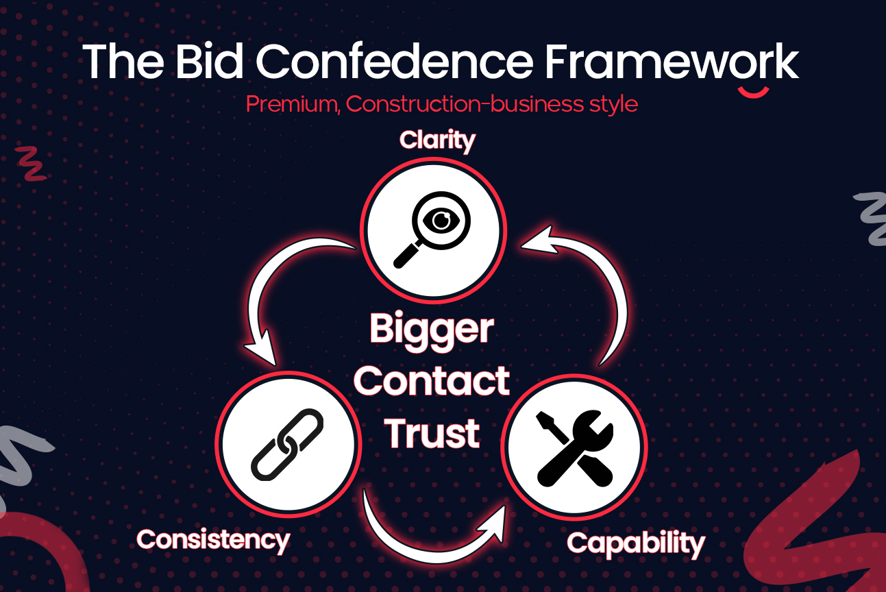
The Bid Confidence Framework has three parts:
- Clarity
- Consistency
- Capability
If a logo fails one of these, the bid may lose strength before the client reaches the price.
- Clarity: Can they understand it fast?
A good construction company logo should be understood quickly.
The company name should be readable. The icon should not be confusing. The design should not be overloaded with tools, rooftops, cranes, bricks, and initials all competing for attention.
Clear does not mean boring. It means useful.
A client should be able to see the logo on a truck, proposal, yard sign, or website and quickly understand who the company is. If the logo needs too much explanation, it is not doing its job.
- Consistency: Does every touchpoint match?
A strong brand feels the same everywhere.
The logo on the truck should match the logo on the estimate. The proposal should match the website. The business card should not look like it belongs to a different company. The colors, fonts, and layout should feel connected.
Consistency builds recognition.
When everything matches, the business feels organized. When everything changes from one place to another, the client may not consciously notice every detail, but they can still feel the disorder.
- Capability: Does it feel contract-ready?
A logo should match the size of work the company wants to win.
A contractor bidding on larger commercial or residential projects needs a brand that feels serious enough for that level of responsibility. This does not mean the logo must look corporate or cold. It means it should feel stable, professional, and ready for higher expectations.
If the company wants bigger contracts but the logo still feels like a quick template from a basic construction logo maker, there is a gap between ambition and perception.
That gap can cost opportunities.
Where Does a Weak Logo Lose Client Trust?
A weak logo rarely fails in only one place. It usually creates problems across several client touchpoints.
| Touchpoint | What the client sees | Risk created |
| Truck branding | Hard-to-read logo or old graphics | Company feels less established |
| Proposal cover | Blurry logo or weak layout | Bid feels less professional |
| Business card | Outdated fonts or cheap print | First impression feels small |
| Website | Different logo or mismatched colors | Brand feels inconsistent |
| Uniforms | Poor logo placement or low clarity | Crew looks less organized |
| Site signage | Small or cluttered logo | Company is harder to remember |
| Social pages | Cropped or distorted logo | Business feels less polished |
The logo is not just one image. It becomes part of the business environment.
A clean logo helps every touchpoint work harder. A weak logo makes every touchpoint feel slightly less convincing.
What Makes Construction Company Branding More Effective?
Fixing a weak logo begins with looking at it the way a client sees it.
Not as the owner who remembers when the company started. Not as the team that knows the quality of the work. But as a buyer comparing several contractors with limited time and a lot at stake.
Many contractors start by searching for construction logo ideas, but the stronger approach is to judge every idea against trust, clarity, readability, and real-world use.
Here is a simple process:
- Collect every version of the logo.
Gather the files used on proposals, trucks, uniforms, signs, websites, ads, and business cards. - Check for mismatches.
If colors, shapes, spacing, or fonts change across materials, the brand needs cleanup. - Test real-world readability.
Print it small. View it from across the room. Place it on a truck mockup. Put it on a dark and light background. - Remove clutter.
A logo should be simple enough to recognize quickly. Too many details weaken impact. - Match it to future work.
The logo should reflect where the company is going, not only where it began.
Professional construction logo design is not about making a contractor look fancy. It is about making the business look credible, clear, and ready for the contracts it wants to win.
This is also where custom logo design services can make a difference. A custom design can consider the company’s market, services, project size, audience, and real-world applications.
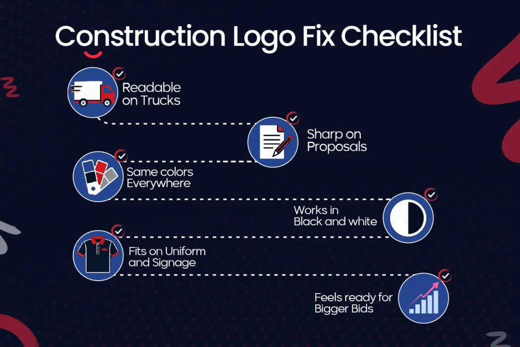
A logo for a general contractor is not used in one place. It has to survive dirt, distance, print, embroidery, signage, email, social media, and proposals. That requires more planning than a quick graphic.
The Logo Audit That Protects Trust
Before paying for a full rebrand, a contractor can run a simple audit.
Use this checklist:
- Is the logo readable on a truck from across the street?
- Does it still work in black and white?
- Does it look sharp on a proposal cover?
- Does the same version appear on the website and documents?
- Does the logo feel different from local competitors?
- Does it match the level of work the company wants?
- Does the brand look organized before the client calls?
- Would a bigger client feel safe shortlisting this company?
If the answer is “no” to several of these, the logo is probably not just a design issue. It is a trust issue.
Logo design packages can be useful when they include more than one file. A contractor should look for a package that provides logo variations, color codes, font guidance, print-ready files, web-ready files, and clear usage rules.
The construction logo design cost should be judged by what the business receives in return, not only by the price of one logo file.
One logo file is not enough for a construction business.
The company needs a small system that keeps the brand consistent wherever the client sees it.
Good Work Hidden by Weak Branding
Imagine a contractor with 12 employees.
The company has grown steadily through referrals. The crew is reliable. The owner knows how to manage projects. The work is good enough for bigger jobs, and the business finally gets invited to bid on a larger residential development.
The estimate is solid.
But the proposal does not look like the company has entered that next level. The logo is stretched on the cover. The project photos are strong, but the layout feels uneven. The truck image shows old branding. The website has a slightly different color scheme. The business card attached to the folder feels dated.
Across the table, another contractor has similar pricing and experience. Their proposal is cleaner. Their construction company logo is bold and readable. Their brand looks consistent from truck to website to proposal.
The buyer may not choose them only because of branding.
But branding helps them feel safer.
That is the point.
A weak logo creates extra work for the contractor. The company has to explain, reassure, and prove more because the first impression did not carry enough confidence.
A stronger brand does not guarantee the contract, but it gives the bid a better chance to be taken seriously.
What should a strong logo communicate?
A strong logo should communicate the right kind of confidence.
For a construction company, that may include:
- Strength
- Stability
- Precision
- Reliability
- Clean workmanship
- Local trust
- Commercial readiness
- Premium service
- Practical problem-solving
The exact message depends on the company.
A FedEx Office survey found that 68% of consumers believe a store’s signage reflects the quality of its products or services, which shows why a construction logo should communicate more than decoration; it should signal trust, workmanship, and the level of project the company is ready to handle.
A luxury residential builder may need a refined and calm identity. A commercial contractor may need a bold and structured look. A concrete company may need durability and weight. A remodeling company may need warmth, care, and attention to detail.
This is why builder logo design should start with positioning, not decoration.
The better question is not, “What symbol looks cool?”
The better questions are:
- What type of client should trust this company?
- What kind of project should the brand attract?
- What should people remember after seeing the logo once?
- What does the current brand accidentally say?
- What does the company need to look ready for next?
When these questions are answered clearly, the design becomes more focused.
How Can Your Logo Make Bigger Clients Trust You?
A contractor who wants bigger contracts should make the brand feel bigger before the pitch.
That does not mean pretending to be something the company is not. It means presenting the real business with more care.
Start with the basics.
Make the logo clean and readable. Keep the colors consistent. Use the same logo version everywhere. Upgrade proposal covers. Make truck branding easy to see. Update business cards. Make sure the website reflects the same identity.
Then improve the surrounding details.
Use better project photos. Add clear service descriptions. Show the types of work the company wants more of. Keep estimates and proposals organized. Make email signatures professional. Use simple language that explains the process, timeline, and expectations.
This is how construction business branding becomes practical.
It helps the company look easier to trust.
It helps the client feel that the contractor has control.
And it helps the business move away from being judged only by price.
The Trust Your Logo Leaves Behind
A weak construction logo does not usually destroy a contract loudly. It costs quietly.
It makes a good company look less prepared. It makes a capable crew look smaller. It makes a fair proposal feel less polished. It makes a contractor easier to compare with every other local builder.
That is why construction company branding matters.
The logo is not the whole business, but it is often the first piece of the business a client sees. When it looks clear, consistent, and contract-ready, it supports trust before the first meeting. When it looks weak, outdated, or generic, it creates doubt before the contractor has a chance to explain the real value.
For construction companies ready to look as serious as the work they deliver, Logo Outlets can help create a professional logo and brand identity built for stronger first impressions. Contact 201-820-6598 or info@logooutlets.com to get started.
FAQ
What is a bad construction logo?
A bad construction logo is hard to read, poorly balanced, outdated, or too generic. It may also fail when used on trucks, proposals, uniforms, or signage.
What are common construction logo mistakes?
Common construction logo mistakes include using too many icons, weak fonts, poor color choices, low-resolution files, and designs that look too similar to competitors.
Can a weak construction logo hurt bids?
Yes. A weak construction logo can make a bid feel less professional, especially when the client is comparing several contractors for a larger project.
Why does a construction logo matter?
A construction logo matters because it helps clients form a first impression of trust, stability, and professionalism before they speak with the contractor.
Why does my company look unprofessional?
A construction company may look unprofessional if its logo, website, trucks, proposals, and business cards do not feel consistent or current.
Is my logo hurting my business?
Your logo may be hurting your business if clients struggle to read it, forget your company name, or see your brand as outdated, cheap, or generic.
What is construction company branding?
Construction company branding is the full identity of the business, including logo, colors, messaging, proposals, vehicles, website, uniforms, and client experience.
How can contractors win bigger contracts?
Contractors can win bigger contracts by improving trust signals, showing relevant work, presenting clear proposals, and making the brand look ready for larger responsibility.
How do clients choose contractors?
Clients choose contractors based on trust, price, experience, communication, reputation, and how confident they feel about the company’s ability to deliver.
How can a contractor stop competing on price?
A contractor can stop competing only on price by building stronger positioning, clearer branding, better proposals, and a reputation that makes value easier to see.